The typography on the label of your product is more than just mere words; it is style and personality too. It is a way to communicate with your customers and represent your brand.
Therefore the font design, style, size, color are all important things to consider. You can also have a combination of fonts. But choosing the Best font for labels is tricky. You want something that is functional but also has a hint of uniqueness to make your label stand out.
Difference Between Typeface and Font
You will hear both terms ‘typeface’ and ‘font’ when choosing a font for the label. A typeface is a font family. For instance, Helvetica is a typeface whereas Helvetica italic, narrow, and light are fonts of that particular typeface.
Put simply, the typeface is the overall design of the characters, and fonts are variations of the typeface. However, for this article, the term font will be used instead of typeface, and the accessories instead of the font.
7 Things to Consider When Choosing the Best Font for Labels
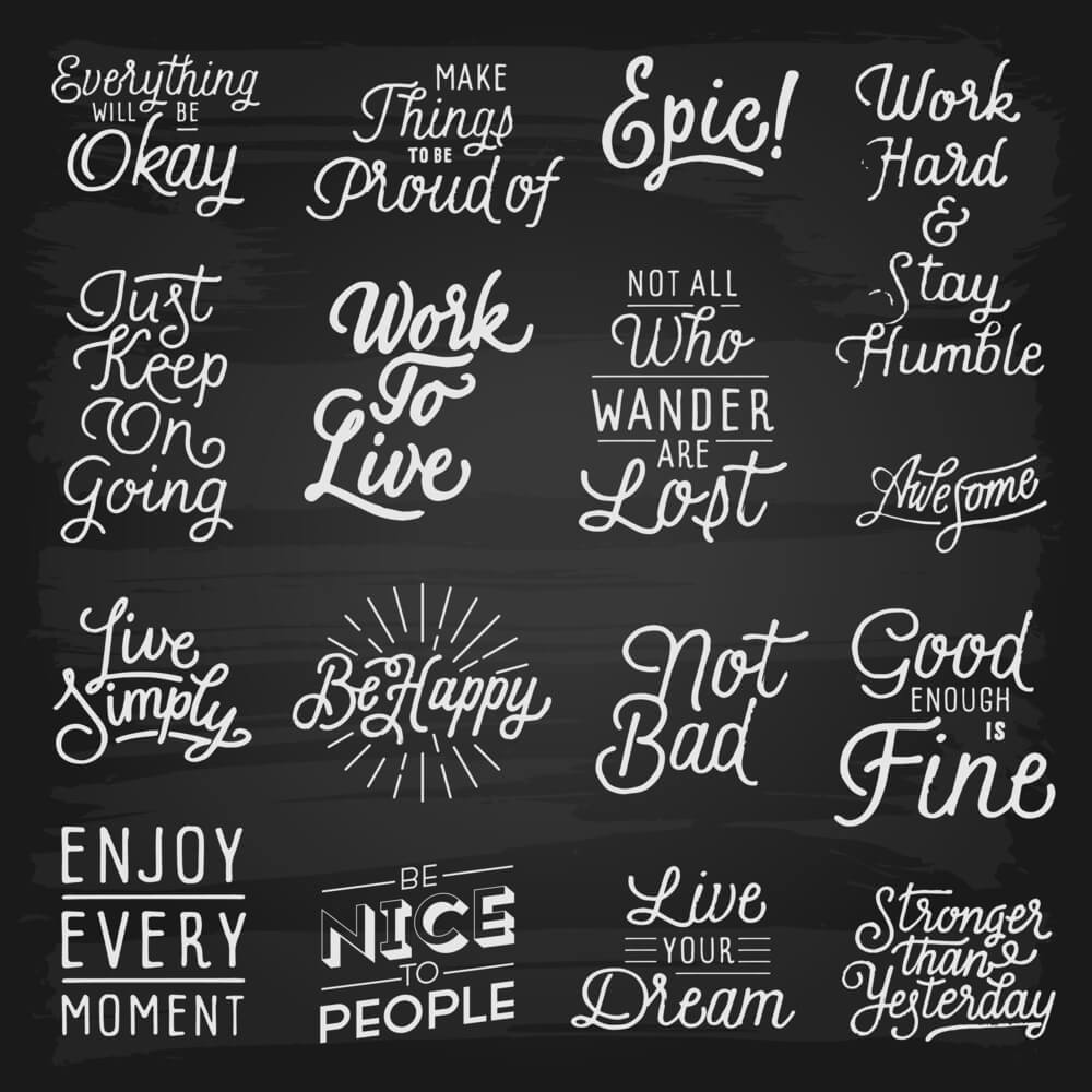
Fonts are expressive. They can be fun, bold, tacky, elegant, and even loud.
Just think about the TIME magazine logo. The classic, thin-lined font represents authority. Now, think about the typography of Coca-Cola. Those swirly letters indicate a more fun persona. Almost every popular brand tries to use a unique font that people can remember.
To choose the Best font for labels, consider the following factors.
1. Your Brand Persona
After coming up with your product, you must think about your brand’s persona and identity. You have to clearly identify what your brand stands for.
Is it something fun, sporty, eco-friendly, or sophisticated? You have to be the judge of that. For instance, if you are selling high-end cosmetic products, then your brand persona should reflect luxury and beauty. In that case, use an elegant font.
If your brand is all about weddings, then consider a calligraphic font that is perfect for formal events and looks amazing on monogram envelope seals and invitations.
For organic food and beverage labels, use clean fonts as they represent simplicity. But for indulgent food, use something more visual and loud.
If you are already using a font on your brand logo, try to use the same or similar font for your label. This makes the brand more recognizable and consistent.
2. Your Audience
Researching your target audience will give you a better idea of what font you should choose. If your label caters to children, you can use bubbly, swirly, or fun fonts. If you have a sophisticated audience, use simple and elegant fonts to grab their attention.
Once you have narrowed down your demographic, it will be much easier for you to choose. However, you still need to do research on font personalities.
3. Understand the Font’s Personality
It may sound surprising but fonts really do have personalities and their font trait has to match with your brand. For instance, a bubbly font on the label of a fancy champagne bottle will never look good.
If you want to portray something elegant, use classic fonts with narrow lines such as Garamond, Lola, BodoniAnt, Script, or Verdana.
Choose fonts that are quirky and fun for personable or playful products. Fonts such as Pacifico, Lobster Two, Gasoline Alley, and Princess Sofia are perfect for this. They have plenty of curves with oscillated highs and lows.
For a bold and modern vibe, choose anything between Gills San, Julius Sans One, Bernhard Fashion, Raleway, or Scada. These forms have a more uniform structure and angular look.
Handwritten fonts may not seem conventional but are very attractive and warm. Fonts such as Loved by the King, Waiting for the Sunrise, Bella Donna, and Homemade Apple look friendly and offer a rustic vibe.
These are only a few personality types. You might have to do a lot more research to find the perfect one for your label but your effort will pay off.
4. The Font Size
If the text is too small, your audience will have a hard time reading it but if it’s too big, it might crowd your label design. Asa rule of thumb you should never use a font smaller than size 5. And remember, the text on a computer screen is more readable than on the label so consider going a size larger.
It can be very hard to choose the right size. To find the right balance, you have to go through trial and error. Print out a draft with different sizes of the same font and compare. This way you can also check the spacing.
Sometimes font sizes will be dictated for you. Government warnings, ingredient lists for beer, and other alcohol labels have a minimum size requirement that you must follow. For these, always use simple fonts and avoid using fancy fonts because they are less readable in smaller sizes. The easiest font to read is Helvetica and Georgia. Other easy to read fonts are-
- Arial
- Verdana
- Calibri
- Rooney
- Open Sans
- Lato
These fonts are clean, take less space, and remain readable even in smaller sizes.
5. Combination of Fonts
Using only one font for everything on your label might seem boring. A combination of fonts can do wonders for your product. But never use more than three types of fonts.
All your favorite fonts can be categorized into Serif and San Serif.
Serif
Serif fonts have a formal design and most of them have a finishing stroke on the letter. Times New Roman is a classic example. Serifs are eye-catching and perfect for the title section of your label as they are the most readable font for print.
San Serif
San Serif fonts are cleaner and do not have any finishing stroke such as Verdana and Helvetica. Serif fonts are easily recognizable and are great choices if your audience is visually impaired or small children.
San Serif fonts are great for the ingredient or important information section of your label because of the readability.
If you are using two fonts, your best choice would be to choose one from each category and see if they complement each other. If you want to choose three types of fonts, then choose one Serif and two San Serif fonts for a good combination.
Your primary font can be whatever you want, but your secondary font should be basic.
The main purpose of the label maker fonts is to be legible to the audience. This is also the reason you should not use over three fonts. The more fonts you combine, the more difficult it becomes for the reader.
No matter how cool the font looks, readability is the key for label fonts. So make sure your combination of fonts looks good and doesn’t overwhelm the reader.
6. Font Accessories
We have quite a few options to accessorize our fonts. We can make them bold, italic, or even underlined. But these embellishments might make your font less readable so be careful.
Using too much bold or italic can create extra noise and take unnecessary space. Underlining can make it difficult for readers to differentiate the letters. A rule of thumb is that if your primary font is fancy, do not use these embellishments; it will only be distracting.
7. The Visual Hierarchy
No one reads everything on a label – at least not all at once. So, your product label should have a visual hierarchy to help people skim through all the information. If your label has a story to tell, then an effective visual hierarchy is even more important to communicate with the customer.
Your label will have a beginning, middle, and end part and in those three sections, there will be some information more important than others. If you use the same font, it will be harder for the customer to distinguish which is more important to read.
You will have to carefully decide which information deserves a heading and which is just going to be printed on the body copy with the secondary font. Big, bold, unique fonts are great openers for your visual hierarchy and introduce your product to the customer. Make sure it is readable, do not over accessorize, and highlight key information in order to help your readers skim through in an orderly manner.
Also, you need to know which kind of label really fits your items. There are uncoated labels, semi-gloss labels, high-gloss labels, inkjet only labels, laser labels, colorful labels, and many more to select from.
Final Thoughts
Inappropriate fonts make your label bland and won’t portray your brand’s message effectively. On the other hand, the right font can enhance your label design and speak to your viewers in more ways than you can imagine. Researching fonts can take time so be patient, create a list of your favorite fonts, and find the one that matches all the criteria listed in this article.