Spice Jar Labels: How to Choose the Right Size, Material & Printing Method

Learn how to choose spice jar labels for pantry organization, seasoning blends and retail products. Compare sizes, materials, sheet and roll labels, printing methods and more.

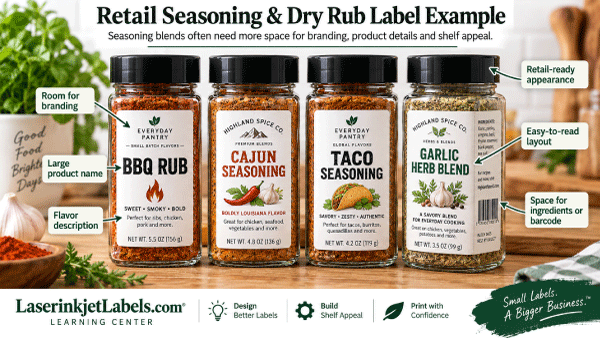
Spice jar labels for retail seasoning and herb containers

A good spice jar label needs to do more than identify what’s inside the container. For businesses selling spices, herbs, dry rubs and seasoning blends, the label also plays an important role in branding, product presentation and helping customers quickly distinguish one product from another.

For home kitchens and pantry organization, the priorities may be simpler: a clean design, easy-to-read spice names and labels that fit neatly on the jars.

Whether you need spice bottle labels for retail packaging, blank seasoning labels for short runs, or printable spice jar labels for pantry organization, the same sizing and material principles apply. This guide also explains when professionally printed custom spice labels are the better choice.

Whether you’re labeling a few jars at home or producing hundreds of seasoning products for retail, choosing the right spice jar labels starts with four decisions:

  • Label size and placement
  • Label material
  • Sheet or roll format
  • How the labels will be printed

This guide will walk through each choice and help you decide which type of label makes the most sense for your spice jars.

Quick Guide to Choosing Spice Jar Labels

Need Good Starting Point
Simple spice name Small rectangular front label
Pantry organization Front label, round lid label, or both
Retail spice jars Larger rectangular front label
Spice jar lids Round labels
Tall spice bottles Vertical rectangular label
Ingredients and product information Larger front or side label
Higher-volume production Roll labels
Small batches or many varieties Sheet labels
Finished labels ready to apply Custom printed labels
Exposure to moisture or frequent handling Moisture-resistant label material

Because spice jars vary considerably in diameter, height and shape, always measure the actual container before ordering.

For detailed size recommendations, see our Spice Jar Label Size Guide.

What Makes a Good Spice Jar Label?

Spice packaging presents a few unique challenges.

The containers are often small, which means there is limited space for a label. At the same time, the most important information needs to remain easy to read.

A successful spice label usually creates a clear visual hierarchy.

The spice or seasoning name should normally be the easiest element to identify. Branding, variety information, ingredients and other details can then be arranged around it according to the amount of available space.

For a retail seasoning blend, for example, you may need room for:

  • Product name
  • Company logo
  • Flavor or variety
  • Ingredients
  • Net weight
  • Directions or suggested uses
  • Barcode
  • QR code
  • Website or contact information
  • Lot or batch information

A jar used only for home pantry organization may need nothing more than Basil, Oregano or Smoked Paprika printed in a clear, consistent style.

The right label depends heavily on how the jar will be used.

Front Labels, Lid Labels or Both?
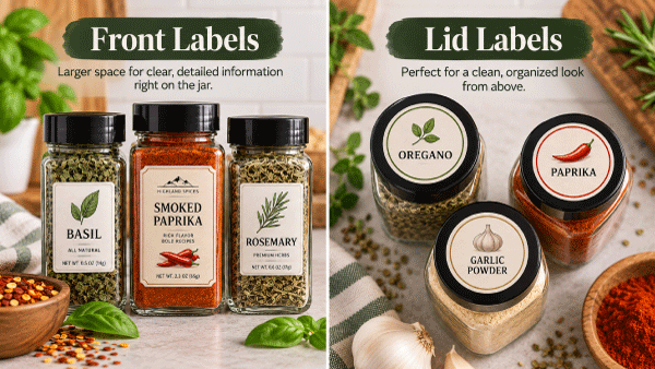
Front and lid placement options for spice jar labels

One of the first decisions is where your spice label should go.

Front Spice Jar Labels

A rectangular label on the front of the jar provides the most visible branding when jars are displayed on shelves.

Front labels work particularly well for:

  • Retail spice jars
  • Seasoning blends
  • Dry rubs
  • Specialty salts
  • Dried herbs
  • Small-batch food products
  • Farmers market products
  • Gift sets

Rectangular labels also provide more room than most lid labels for ingredients, branding and product information.

Spice Jar Lid Labels

Round labels are an excellent choice for lids.

They’re especially useful when spice jars are stored in a drawer, countertop rack or cabinet where customers or family members may view the jars from above.

A lid label can display:

  • Spice name
  • Flavor
  • Logo
  • Color coding
  • Product variety

Small spice containers may use only a lid label.

Using Both

Coordinated front and lid labels on spice jars

For retail packaging or an organized pantry, using both can create an especially polished appearance.

For example:

Front label:
SMOKED PAPRIKA
Brand name and product information

Lid label:
SMOKED PAPRIKA

The customer can identify the product whether viewing it from the front or from above.

What Size Label Works Best on Spice Jars?
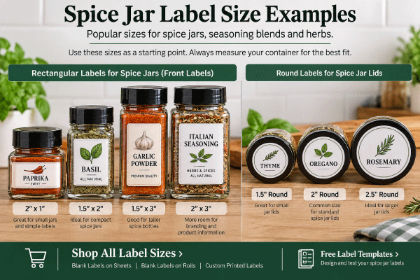
Common rectangular and round spice jar label sizes

There isn’t one standard spice jar size, so there isn’t one universal label size.

However, several smaller label sizes work particularly well for common spice containers.

  • 2″ x 1″ for small jars and simple spice names
  • 1.5″ x 2″ for compact front labels
  • 1.5″ x 3″ for taller spice bottles
  • 2″ x 3″ when additional branding or information is needed
  • 1.5″ round for small lids
  • 2″ round for standard lids
  • 2.5″ round for larger lids

These should be treated as starting points rather than guaranteed fits.

Jar designs differ between manufacturers, even when the advertised container capacity is the same.

Test the Size Before Ordering

A simple way to test a label is to print the proposed size on plain paper.

Cut it out and place it against the actual spice jar.

Check that:

  • The label stays within the smooth portion of the container.
  • The edges don’t extend onto heavily curved areas.
  • The product name remains easy to read.
  • Important information isn’t wrapped too far around the side.
  • The label looks proportionate to the container.

You can also use our free label templates to test common label sizes before purchasing your blank labels.

For a more detailed chart, visit our Spice Jar Label Size Guide.

Choosing a Label Material for Spice Jars

Once you know the size, the next question is material.

The best material depends on the appearance you want and the environment where the jar will be used.

White Matte or Uncoated Labels

White labels are one of the most versatile choices for spice packaging.

They’re a good option for:

  • Pantry labels
  • Small spice businesses
  • Ingredient labels
  • Retail products
  • Test batches
  • Short production runs

A white background also gives you a neutral surface for printing logos, colors and photographs.

Gloss Labels

Gloss materials can give retail spice packaging a more polished appearance.

They’re particularly useful when your artwork includes:

  • Bright colors
  • Detailed logos
  • Product photography
  • High-contrast graphics

A glossy finish can help seasoning blends and specialty spices stand out on a retail shelf.

Kraft Labels

Brown kraft labels can complement products positioned around a handmade, natural, rustic or small-batch appearance.

They can work especially well for:

  • Artisan seasoning blends
  • Barbecue rubs
  • Specialty salts
  • Farm-produced herbs
  • Farmers market products
  • Gift sets

Remember that the brown background becomes part of the design, so artwork that looks good on white stock may need to be adjusted for kraft.

Moisture-Resistant Materials

Spice jars aren’t normally exposed to the same conditions as refrigerated beverage containers, but kitchen environments can still involve moisture, cooking residue, oils and frequent handling.

For products that may encounter these conditions, consider a more durable or moisture-resistant material.

It’s always wise to test the actual label stock with your container and printer before committing to a large production run.

Sheet Labels vs. Roll Labels for Spice Jars

Both formats can work well. The better choice depends primarily on your printer and production volume.

Blank Sheet Labels

Blank labels on sheets are a good choice when you want to print labels using a compatible standard laser or inkjet printer.

Sheets make sense for:

  • Small batches
  • Home spice organization
  • Startup spice businesses
  • Frequently changing varieties
  • Seasonal products
  • Test products
  • Short production runs

For example, a small seasoning company might print several sheets of taco seasoning today, garlic herb tomorrow and barbecue rub later in the week.

That flexibility can make sheet labels very practical.

Blank Roll Labels

Blank labels on rolls are intended for compatible roll label printers.

Roll labels become especially attractive when you’re printing higher quantities or using dedicated color label printers such as compatible Epson ColorWorks, Primera or Afinia systems.

They’re useful for:

  • Growing spice businesses
  • Larger production runs
  • Frequent label printing
  • Many product varieties
  • Production environments
  • Businesses already using a roll label printer

Roll-fed printing also eliminates the need to feed individual sheets through the printer.

Custom Printed Spice Labels

If you don’t want to print labels yourself, another option is to have them professionally printed.

Custom printed labels arrive finished and ready to apply to your spice jars.

This can make sense when:

  • Your artwork doesn’t change frequently.
  • You’re producing larger quantities.
  • You don’t want to maintain your own label printer.
  • You want labels ready for production when they arrive.

Printing Spice Jar Labels In-House

Printing your own labels can be particularly useful for spice and seasoning companies because product lines often contain many different varieties.

One company might sell:

  • Garlic powder
  • Onion powder
  • Smoked paprika
  • Cajun seasoning
  • Taco seasoning
  • Italian seasoning
  • Steak seasoning
  • Barbecue rub
  • Lemon pepper
  • Specialty salts

If every variety required a separate large order of preprinted labels, inventory could become difficult to manage.

Printing blank labels as needed lets you maintain blank label inventory and produce the specific design you need.

This is especially helpful for:

  • Limited-production flavors
  • Seasonal products
  • New product testing
  • Private-label products
  • Small-batch seasoning blends

Designing Spice Labels That Are Easy to Read

Spice label layout and sizing examples for small jars

Small containers require disciplined design.

Trying to fit too much information onto the front of a small spice jar can make the label difficult to read.

Start with the information customers need to see first.

Make the Spice Name Prominent

Someone standing in front of a spice rack should quickly be able to distinguish:

BASIL

from

OREGANO

from

THYME

Avoid making the brand name so dominant that the actual spice becomes difficult to identify.

Use Consistent Design Across the Product Line

If you’re selling multiple seasonings, a consistent label system makes the entire product line look more professional.

Keep elements such as these consistent:

  • Logo placement
  • Font family
  • Label size
  • Product-name location
  • Barcode location
  • Net-weight placement

Then distinguish products using controlled changes such as color, imagery or flavor names.

Don’t Overcrowd the Front Label

If ingredients or other information make the front difficult to read, consider using a second label on the back or side.

The front can concentrate on the product name and branding while the secondary label carries supporting information.

Spice Labels for Seasoning Blends and Dry Rubs

Seasoning blends often need more label space than single-ingredient spices.

A jar labeled simply Ground Cinnamon may require relatively little explanation.

A specialty barbecue seasoning may need room for:

  • Product name
  • Flavor description
  • Ingredients
  • Suggested uses
  • Preparation instructions
  • Company information
  • Barcode
  • Website
  • QR code

For these products, consider a larger rectangular label rather than trying to force everything onto a small decorative label.

Tall spice bottles can be particularly useful because they often provide additional vertical space for label information.

Using QR Codes on Spice Jar Labels

A QR code allows a small jar to connect customers with information that doesn’t fit comfortably on the label.

A spice company might link a QR code to:

  • Recipes
  • Cooking instructions
  • Product information
  • Reorder pages
  • Videos
  • Social media
  • Related seasonings

For example, a taco seasoning label could link customers directly to recipes using that blend.

Make sure the code is large enough to scan reliably and always test it after printing.

Barcodes on Retail Spice Labels

If your spice product will be sold through retail stores, you may also need space for a barcode.

Smaller spice containers make barcode placement particularly important.

Before finalizing the design:

  1. Determine how much room your barcode requires.
  2. Keep the barcode away from heavily curved portions of the container when possible.
  3. Maintain adequate contrast around the barcode.
  4. Print and test the finished label.
  5. Verify the code scans after the label has been applied to the actual jar.

Don’t assume that a barcode that scans perfectly on a computer screen will perform exactly the same after being reduced and printed.

Common Spice Jar Label Mistakes

A few simple mistakes can create unnecessary production problems.

Choosing the Label Before Choosing the Jar

Select your production container first whenever possible.

Then measure the actual jar.

Changing container suppliers later can also change the usable label area.

Placing Labels Across Curves

Labels generally perform best on the smoothest available portion of the jar.

Avoid positioning an edge directly over a strong shoulder, ridge or curve.

Making Text Too Small

Just because information technically fits doesn’t mean customers can comfortably read it.

Prioritize important information and use additional label space when necessary.

Using the Wrong Material for the Printer

Label materials may be designed specifically for inkjet, laser or particular roll-fed printing systems.

Always confirm material and printer compatibility before ordering.

Printing a Full Production Run Without Testing

Print several test labels first.

Check:

  • Color
  • Alignment
  • Text size
  • Barcode scanning
  • QR-code scanning
  • Adhesion
  • Overall appearance

A five-minute test can prevent wasting an entire production run.

Popular Uses for Spice Jar Labels

Spice jar labels aren’t limited to traditional grocery-store spices.

The same types of labels can be used for:

  • Dried herbs
  • Seasoning blends
  • Barbecue rubs
  • Specialty salts
  • Pepper blends
  • Baking spices
  • Tea blends
  • Dry mixes
  • Chili powders
  • Taco seasonings
  • Restaurant prep containers
  • Farmers market products
  • Gift sets
  • Wedding favors
  • Pantry organization
  • Private-label food products

This makes small rectangular and round labels useful sizes to keep available if your business produces multiple types of packaged products.

Where to Start

If you’re still deciding which spice jar label you need, start with the container.

  1. Measure the usable flat area.
  2. Decide whether you want a front label, lid label or both.
  3. Determine how much information needs to appear on the label.
  4. Choose a material appropriate for your printer and environment.
  5. Test the proposed label size using a paper template.
  6. Choose sheet labels, roll labels or custom printed labels based on your production process.

For specific size recommendations, visit our Spice Jar Label Size Guide.

Shop Labels for Spice Jars

LaserInkjetLabels.com offers blank labels for businesses printing their own spice labels, along with custom printed options for businesses that want finished labels ready to apply.

Shop Blank Label Sheets

Print your own spice labels with compatible laser or inkjet printers.

Shop Blank Sheet Labels

Shop Blank Roll Labels

Print spice and seasoning labels with compatible roll-fed inkjet label printers.

Shop Blank Roll Labels

Custom Printed Labels

Have your spice labels professionally printed and delivered ready to apply.

Shop Custom Printed Labels

Free Label Templates

Set up your artwork and test label placement before printing.

Browse Free Label Templates

Frequently Asked Questions About Spice Jar Labels

What size labels are best for spice jars?

Front and lid label options for spice jars

Common starting points include 2″ x 1″, 1.5″ x 2″, 1.5″ x 3″ and 2″ x 3″ rectangular labels. Round labels such as 1.5″, 2″ and 2.5″ are commonly used for lids. Because jar dimensions vary, measure your actual container before ordering.

What type of label should I use for spice jars?

White matte or uncoated labels are versatile for everyday spice labeling, while gloss materials can provide a more polished retail appearance. Kraft labels can create a rustic appearance. For jars likely to encounter moisture, oils or frequent handling, consider a more durable moisture-resistant material.

Can I print my own spice jar labels?

Yes. Blank label sheets can be printed using compatible laser or inkjet printers, while blank roll labels can be printed using compatible roll-fed label printers. Make sure the material you select is designed for your particular printer.

Are round or rectangular labels better for spices?

Rectangular labels generally provide more room for product names, ingredients and branding on the front of the jar. Round labels are particularly useful on spice jar lids. Many products use both.

Should I use sheet or roll labels?

Sheet labels are convenient for smaller runs and businesses using standard compatible printers. Roll labels can be more efficient for higher-volume production with dedicated roll label printers.

Can I use spice jar labels for seasoning blends?

Yes. The same labels work well for seasoning blends, barbecue rubs, herbs, specialty salts, dry mixes and similar packaged food products.

Can I add barcodes and QR codes to spice labels?

Yes. Both can be incorporated into the design if enough label space is available. Always test printed barcodes and QR codes on the finished jar before beginning a full production run.

How can I test a spice label size before ordering?

Download a free label template, print the proposed size at 100% actual size, cut it out and position it on your spice jar. This gives you a simple real-world preview of the size and placement.

Where can I find exact spice jar label size recommendations?

See our complete Spice Jar Label Size Guide for recommended sizes for small, standard, tall and larger spice containers.
Coffee Bag Labels: How to Choose the Right Size, Material & Printing Method

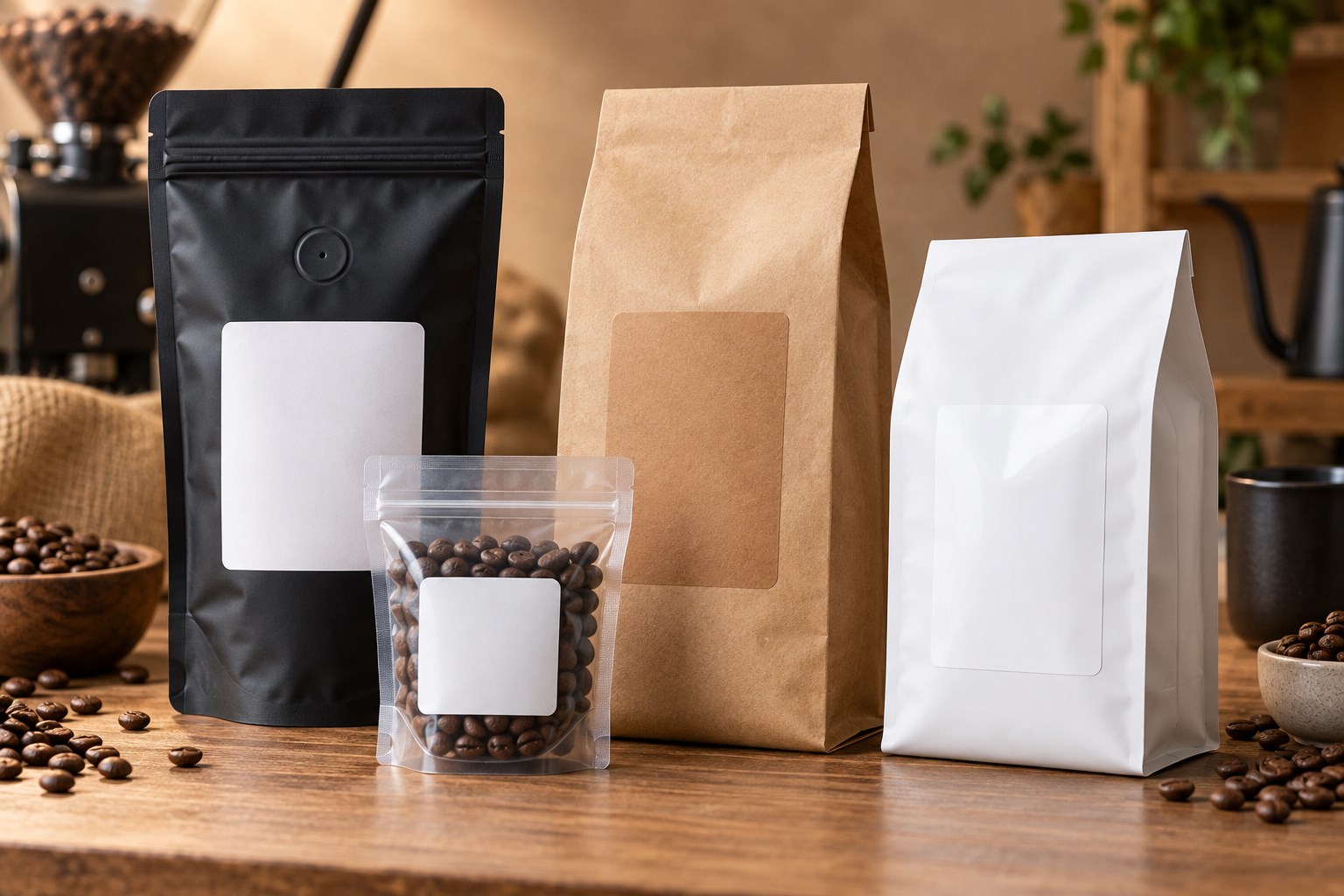
Four coffee bag packaging styles with blank matte, gloss, kraft and clear labels
Coffee bag labels can be matched to stand-up pouches, side-gusset bags, flat-bottom bags and sample packages.

Coffee bag labels turn a plain pouch into retail-ready packaging, but the right choice depends on more than the bag’s stated weight. Zippers, heat seals, side seams, gussets and one-way degassing valves all reduce the smooth area available for a label. The label also needs enough space for the coffee name, roast level, origin, tasting notes, net weight, barcode and variable information such as the roast date.

This buying guide explains how to choose a workable size, material and printing method for sample bags, 4 oz, 8 oz, 12 oz, one-pound and bulk coffee packages. Start with our Coffee Bag Labels page to browse available options. If you already know your package capacity and want a more detailed size lookup, use the Coffee Bag Label Size Guide.

Quick Start Guide

Use these recommendations as starting points, not universal specifications. Bags with the same stated capacity can have different dimensions and valve locations. Measure the filled package, then tape a paper mockup to the bag before ordering.

Package Starting label sizes Good starting material Typical format
2 oz sample bag 2" × 3" or 2" × 4" White matte or kraft Sheet labels
4 oz coffee bag 2.5" × 4" or 3" × 4" White matte, gloss or kraft Sheet or roll
8 oz coffee bag 3" × 4", 3" × 5" or 4" × 4" Matte, gloss, clear or kraft Sheet, roll or printed
12 oz coffee bag 3" × 5", 4" × 5" or 4" × 6" Matte, gloss, clear or kraft Sheet, roll or printed
16 oz / 1 lb bag 4" × 5", 4" × 6" or 5" × 5" White matte, gloss or kraft Sheet, roll or printed
Bulk coffee bag 5" × 6" and larger Match material to the surface and handling Roll or custom printed

At-a-Glance Recommendations

  • Best versatile finish: white matte.
  • Best for colorful retail graphics: white gloss or semi-gloss.
  • Best for a natural artisan presentation: brown kraft.
  • Best minimalist appearance: clear film, provided the package color supports the design.
  • Best for added moisture resistance: a compatible synthetic film.
  • Best for short runs and frequent flavor changes: blank sheet labels.
  • Best for a compatible roll-fed production workflow: blank roll labels.
  • Best when you do not want to print in-house: custom printed labels.

LaserInkjetLabels Pro Tip

Do not choose a label from the bag’s stated weight alone. Fill the actual package, close the zipper, let the gussets expand and test a full-size paper label. This reveals fit problems that are easy to miss when measuring an empty, flattened bag.

Quick Coffee Bag Label Size Chart

The usable panel matters more than the nominal capacity. Choose a label that leaves an uncovered border on every side and does not bridge a structural feature. When two sizes fit, the smaller option is often easier to apply smoothly; the larger option provides more room for branding and required information.

Bag capacity Compact option Balanced option Maximum-information option
2 oz 2" × 3" 2" × 4" Front and back labels
4 oz 2.5" × 4" 3" × 4" Front and back labels
8 oz 3" × 4" 3" × 5" 4" × 4"
12 oz 3" × 5" 4" × 5" 4" × 6"
1 lb 4" × 5" 4" × 6" 5" × 5"
Bulk 5" × 6" Size to the flat panel Separate branding and information labels

For additional package-specific examples, visit the complete coffee bag label size guide or browse all label size guides.

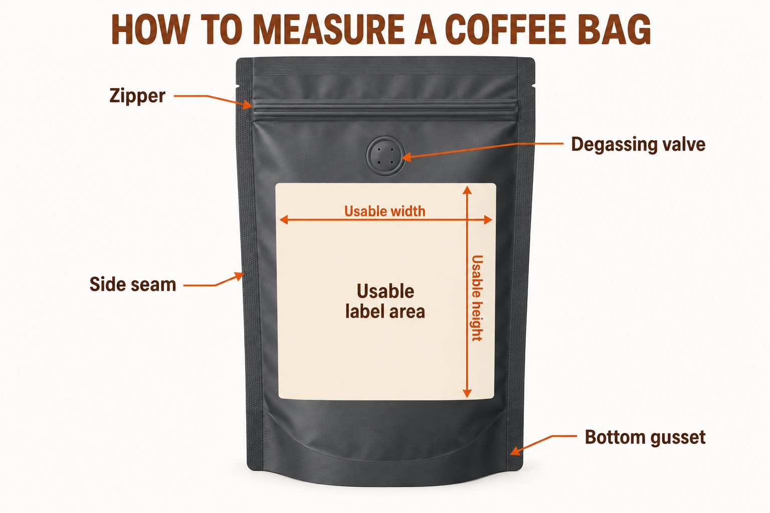
How to Measure the Usable Label Area

Measure the smooth rectangle where the label will actually make full contact. Do not measure the total width and height of the flattened package.

  1. Fill and close the bag. A filled pouch expands and its gussets change the front-panel dimensions.
  2. Mark every no-label zone. Identify the zipper, top heat seal, side seams, bottom gusset and degassing valve.
  3. Measure usable width. Measure between the left and right boundaries of the smooth panel, then subtract a small safety margin.
  4. Measure usable height. Measure between the zipper or valve clearance and the point where the bottom gusset begins to curve.
  5. Test with paper. Print or cut the proposed size at 100% scale, tape it in place and flex the filled package.
Diagram showing the zipper, degassing valve, side seam, bottom gusset and usable label area on a coffee bag
Measure only the smooth, flat panel that remains after allowing clearance for the zipper, valve, seams and bottom gusset.

Download the matching layout from our label templates library and print it on ordinary paper before using label stock.

Stand-Up Pouches vs. Side-Gusset and Flat-Bottom Bags

Stand-Up Pouches

Stand-up pouches usually have a broad front panel but lose usable height to the zipper and bottom gusset. Apply the label after the pouch is filled so the expanding base does not pull the label around a curve.

Side-Gusset Bags

Traditional side-gusset bags often have a narrower front face and long vertical folds. Keep the label entirely on the center panel unless the material and adhesive have been tested to flex across the gusset.

Flat-Bottom Bags

Flat-bottom bags can provide a stable rectangular face, but corner folds and upper closures still reduce the labelable area. Their structured shape often supports a larger front label and a separate information label on the back.

For broader pouch, box and container guidance, see our Packaging Labels resource.

Recommended Labels by Coffee Bag Size

2 oz Sample Bags

A 2" × 3" or 2" × 4" label usually provides enough space for the coffee name, roast and a small logo. If the sample pouch is narrow, a tall 2" × 5" label may work only when the usable panel and valve placement allow it.

4 oz Bags

Start with 2.5" × 4" or 3" × 4". A compact label keeps more of a premium pouch visible, while the wider option supports origin, tasting notes and a QR code.

8 oz Bags

Common starting points are 3" × 4", 3" × 5" and 4" × 4". Check the filled bag carefully because short, wide 8 oz pouches and tall, narrow pouches need different proportions.

12 oz Bags

Start with 3" × 5", 4" × 5" or 4" × 6". The 4" × 5" size balances branding and information on many retail bags; 4" × 6" is useful when the package has a large uninterrupted front panel.

16 oz / One-Pound Bags

Start with 4" × 5", 4" × 6" or 5" × 5". Large labels can look balanced on one-pound packaging, but leave enough uncovered space for the bag to flex during filling, shipping and customer handling.

Bulk Coffee Bags

Use 5" × 6" or a larger format sized to the actual panel. For wholesale packaging, consider separating the permanent brand label from the variable product, lot and roast information.

How to Avoid Zippers, Seams, Gussets and Degassing Valves

  • Zippers: leave space so customers can open and reseal the package without rubbing the label edge.
  • Heat seals: do not apply across the thick or uneven sealed band.
  • Side seams: keep all label edges on the smooth center panel to reduce lifting.
  • Bottom gussets: position the label above the area that unfolds when the bag is filled.
  • Degassing valves: never cover the valve or place adhesive against its edge.

Front-Only vs. Front-and-Back Labels

A single front label can work for a minimalist product with limited copy. Use separate labels when the design must accommodate origin, variety, process, tasting notes, brewing suggestions, business information, ingredients, net quantity, barcode and QR code. Splitting the content usually improves hierarchy: branding and buying information stay on the front, while supporting and variable information moves to the back.

White Matte vs. Gloss, Kraft, Clear and Waterproof Materials

Material Best for Watch for
White matte Versatile branding, readable text and understated packaging Standard paper is less suitable for repeated moisture exposure
Semi-gloss or high gloss Vibrant color, photography and polished retail presentation Confirm printer compatibility and allow ink to dry as directed
Brown kraft Natural, handmade and small-batch positioning The brown background changes printed colors; dark, high-contrast artwork works best
Clear film A minimalist no-label appearance and visibility of the bag underneath Desktop printers generally do not print white; package color affects contrast
Waterproof or water-resistant film Moisture, condensation, spills and frequent handling Match the film to the printer and test the printed ink as well as the face stock

Material performance depends on the complete system: face stock, adhesive, ink or toner, package surface and storage conditions. Compare options on the Waterproof Labels page and request samples before a large order.

Sheet vs. Roll vs. Custom Printed Labels

Format Best fit Main advantage Confirm before ordering
Blank sheet labels Short runs, startups, seasonal coffees and frequent design changes Print on a compatible desktop inkjet or laser printer Printer type, material and sheet layout
Blank roll labels Growing production with a dedicated roll-label printer Efficient one-at-a-time or batch printing Maximum width, core, outside diameter, sensing and unwind direction
Custom printed labels Consistent designs and businesses that do not want to print in-house Finished labels arrive ready to apply Artwork, quantity, material, proof and lead time

Printing Coffee Labels In-House

  1. Match the material to the printer. Use sheet stock specifically rated for laser or inkjet printing, or rolls that meet the specifications of the roll printer.
  2. Use the correct template. Design at the exact label dimensions and keep critical text away from the cut edge.
  3. Print at 100% scale. Disable fit-to-page, shrink-to-fit and other automatic scaling.
  4. Run a paper alignment test. Hold the test behind a label sheet or place it on the bag before using label stock.
  5. Test color and drying. Printer, ink, toner and coating combinations can change color and durability.
  6. Apply to a clean, dry surface. Remove coffee dust, oil, moisture and fingerprints, then smooth the label from one edge to the other.

Browse blank labels by printer type and use the free label templates to check alignment.

What Information Belongs on a Coffee Label?

The exact requirements depend on the product, ingredients, package, sales channel and jurisdiction. A practical coffee label commonly reserves space for:

  • Brand and coffee name
  • Origin, region, farm or blend name when used
  • Roast level, variety and processing method
  • Tasting notes and brewing suggestions
  • Net quantity
  • Business name and contact information
  • Ingredients and allergen information when applicable, including flavored or blended products
  • Roast date, best-by date, lot code or batch identifier
  • UPC barcode, SKU or QR code
  • Storage or handling instructions when useful

Compliance note: This guide provides packaging and label-selection information, not legal advice. Verify the current federal, state, local, retailer and marketplace requirements that apply to your product before printing production labels. For related packaging options, see Food Labels.

Roast-Date and Variable-Information Labels

Coffee businesses often keep the main brand design constant while changing the origin, roast date, lot number or grind. Three workflows are common:

  • One fully variable label: print the complete label for each batch. This is flexible but requires careful color and inventory control.
  • Permanent brand label plus a small variable label: order or print the main branding in volume, then add a smaller date or product-identity label as needed.
  • Writable or stampable field: reserve a high-contrast area for a date stamp or appropriate permanent marker and test for smearing.

Choose a workflow that prevents old dates, origins or lots from being applied accidentally. Keep variable data legible and separate from decorative elements.

Barcode and QR-Code Considerations

  • Use dark code elements on a light, plain background.
  • Preserve the required quiet zone around the code.
  • Avoid seams, folds, strong curves, gussets and reflective glare.
  • Do not reduce a code below the size supported by its specification and scanner environment.
  • Export artwork at sufficient resolution and avoid resampling that softens edges.
  • Scan several printed samples on the filled package using the devices customers or retailers will use.
  • For QR codes, test the final destination and keep it maintained for the life of the package.

Common Coffee Bag Label Mistakes

Mistake Why it causes trouble Better approach
Choosing by bag weight alone Capacity does not reveal the usable panel dimensions Measure the filled, closed package
Using the largest label that technically fits Edges may reach curves, seams or gussets and begin lifting Leave a visible safety margin
Covering the valve The one-way valve may not function as intended Keep the label and adhesive clear of the valve
Using the wrong printer material Ink may smear, toner may not fuse or sheets may feed poorly Match the stock to the printer technology
Designing before choosing the size Important copy may become too small or crowded Choose and test the physical label first
Skipping an adhesion test Coated, textured or flexible bags can behave differently Request samples and test during storage and handling
Applying to a dusty bag Coffee dust and oils reduce adhesive contact Clean and dry the package before application
Failing to test barcodes A code can look correct but fail after printing or application Scan final production samples on filled bags

How These Recommendations Were Developed

These starting sizes reflect common coffee-bag capacities, typical uninterrupted panel areas and label formats available from LaserInkjetLabels.com. They are intended to narrow the choices, not replace a physical test. Packaging construction, coatings, storage, filling and application conditions can change fit and adhesion, so the final recommendation should always be confirmed on the actual bag.

Frequently Asked Questions About Coffee Bag Labels

What size label works best for a 12 oz coffee bag?

Common starting sizes for a 12 oz coffee bag are 3" × 5", 4" × 5" and 4" × 6". The best choice depends on the bag width, zipper, gussets, seams and degassing-valve position, so measure the smooth usable panel before ordering.

What size label should I use for a one-pound coffee bag?

For many 16 oz or one-pound coffee bags, 4" × 5", 4" × 6" and 5" × 5" are useful starting points. Test a paper mockup on the filled bag to confirm that the label stays flat and does not cross a seam or gusset.

Which label material is best for coffee packaging?

White matte is a versatile all-around choice, gloss white makes colorful graphics look more vibrant, brown kraft supports a natural artisan appearance, clear labels create a minimalist look and waterproof film provides additional moisture resistance.

Can I print coffee bag labels in-house?

Yes. Blank sheet labels work well with compatible desktop laser or inkjet printers for short runs and frequent flavor changes. Blank roll labels are intended for compatible roll-fed printers, while custom printed labels are a practical choice when you do not want to print them yourself.

Where should a label be placed on a coffee bag?

Place the label on a smooth, flat panel and leave clearance around the zipper, heat seal, side seams, bottom gusset and degassing valve. Apply a full-size paper sample to the filled package before committing to a production run.

Should coffee bags use one label or separate front and back labels?

A front-only label can work when it has enough space for branding and required product details. Separate front and back labels provide more room for origin, tasting notes, brewing information, company details, barcodes and QR codes.

Can a coffee label cover the degassing valve?

No. Keep the label and adhesive away from the one-way degassing valve so it can release gas as intended. Measure from the valve edge when calculating the usable label area.

What should I consider when adding a barcode or QR code?

Use strong contrast, preserve the required blank quiet zone and avoid placing the code across a seam, curve or gusset. Print and scan a test at the final size on the actual package before production.

Need More Help Choosing Coffee Bag Labels?

Test the label on your actual packaging before committing to a larger quantity. Send the bag dimensions, usable panel size, printer model, preferred finish, expected moisture exposure and approximate quantity when requesting help.

Contact LaserInkjetLabels.com or request samples to check size, material, print quality and adhesion on the actual coffee bag.

How to Print Mailing Labels: 8-Step Guide

How to print mailing labels for envelopes, padded mailers and shipping packages


Learning how to print mailing labels involves more than typing an address into a rectangle. The label must be large enough for the information, match the template and printer, remain flat on the mailpiece and preserve the readability of any postal or carrier barcode. A compact return-address label, a recipient-address label and a complete carrier shipping label serve different purposes and should not be treated as interchangeable.

This guide explains the complete workflow for creating and printing mailing labels at home or in a business: choosing a size, measuring the envelope or package, formatting an address, preparing a mailing list, testing a template, selecting a material and applying the finished label. It covers individual letters, mail-merge projects, padded mailers, ecommerce packages and packing-slip workflows.

If you only need dimension recommendations, use the dedicated Mailing Label Size Guide. This article focuses on the full create-print-apply process.

The most important rule: match the document settings to the exact label product and print at 100% or actual size. Even a small scaling or margin change can move an entire sheet out of alignment.


Quick Start: How to Print Mailing Labels

  1. Identify the label job. Decide whether you need a return address, recipient address, branded mailer label or carrier-generated shipping label.
  2. Choose a size. Use 0.5" × 1.75" for many compact return addresses, 1" × 2.625" for standard address labels and 4" × 6" for many complete carrier labels.
  3. Measure the mailpiece. Keep the label on one flat surface and away from folds, flaps, closures, seams and box edges.
  4. Download the exact template. Match the product number, sheet layout, margins, gaps and label dimensions.
  5. Format or merge the addresses. Use complete, readable address data with a simple typeface and strong contrast.
  6. Print a plain-paper test. Print at actual size, place the test behind a label sheet and hold both to a light to check alignment.
  7. Print one label sheet. Load the correct side and orientation, use a compatible material setting and inspect the first sheet before continuing.
  8. Apply and verify. Place the label smoothly on a clean, flat area and confirm every address and barcode remains unobstructed.
Mailing Task Practical Starting Size Typical Format
Compact return address 0.5" × 1.75" Sheet label
Standard recipient address 1" × 2.625" 30-up sheet layout
Large address or branded mailer label 4" × 1.33" or 4" × 2" Sheet or compatible roll
Large mailer or address-only package label 4" × 3.33" Sheet or compatible roll
Complete carrier shipping label 4" × 6" Two per letter-size sheet or compatible roll

These dimensions are starting points. Use the format produced by the mailing or shipping system and confirm the usable surface on the actual envelope, mailer or package.


At-a-Glance Mailing Label Recommendations

Most common recipient-address size 1" × 2.625"
Common complete shipping-label size 4" × 6"
Best economical material for dry mail White uncoated paper
Best starting point for added moisture and abrasion resistance Printer-compatible white poly
Best format for desktop inkjet or laser printers Blank sheet labels
Best format for packing slip plus peel-off label Integrated label form
Most important print setting 100% or actual size; do not use Fit to Page
Best first quality check Plain-paper alignment test followed by one label sheet

Mailing Labels, Address Labels and Shipping Labels Are Different

The term mailing label is broad. Before opening a template, determine which type of label the job requires.

Label Type What It Contains How It Is Created
Return-address label Sender name and return address Typed once and repeated across a sheet
Recipient-address label One delivery address per piece Typed individually or produced with a mail merge
Branded mailing label Address plus a logo, department, reference or limited message Designed in the matching blank-label template
Carrier shipping label Addresses, service, routing data, tracking number and barcodes Generated by USPS, a parcel carrier or shipping platform
Integrated shipping label Peel-off carrier label attached to a packing slip or invoice sheet Printed from compatible order-fulfillment software

Do not rebuild, crop or decorate a carrier-generated label as though it were an ordinary address label. Select the correct label format in the shipping system and preserve its layout, barcode proportions and clear areas.


Choose the Right Mailing Label Size

The label needs enough room for every address line at a readable size, but it must remain entirely on one flat portion of the mailpiece. A larger label is useful when an address includes a company, attention line, suite, department or international information. It is not useful if the extra size makes the label cross an envelope edge or box seam.

  • 0.5" × 1.75" – compact return addresses on letter envelopes
  • 1" × 2.625" – standard recipient addresses and larger return addresses
  • 4" × 1.33" – extended addresses and narrow branded mailer labels
  • 4" × 2" – large addresses for padded mailers and address-only packages
  • 4" × 3.33" – larger mailers, boxes and information-rich labels
  • 4" × 6" – complete carrier shipping labels and large logistics labels

For a detailed comparison by mailpiece, including envelopes, padded mailers and packages, see What Size Mailing Label Do I Need?

Return-address, standard address, large mailer and 4 x 6 shipping label size comparison


How to Measure an Envelope, Mailer or Package

Use the actual mailpiece, not only the supplier dimensions. Seams, closures, padding and corrugation can reduce the flat usable area.

  1. Choose the address side. Reserve room for postage and any carrier markings before choosing the label location.
  2. Find one flat surface. Exclude envelope flaps, padded seams, tear strips, box folds, tape and strongly textured areas.
  3. Measure usable width and height. Measure inside the boundaries rather than to the physical edges of the mailpiece.
  4. Allow clearance. Keep every label corner on the same surface so it can make full adhesive contact.
  5. Check content at actual size. Confirm the complete address and any barcode fit without shrinking the type or code.
  6. Make a paper mockup. Cut a rectangle to the proposed dimensions, place it on the mailpiece and inspect it from every side.

How to measure the flat usable area of an envelope, padded mailer and box for a mailing label


How to Format a Mailing Address

USPS recommends placing the address and postage on the same side of a mailpiece. On a letter, the address should run parallel to the longest side. USPS also recommends simple type, strong contrast and left-justified lines. Current postal standards should take priority over decorative preferences.

A typical domestic address block follows this order:

RECIPIENT OR COMPANY NAME
STREET ADDRESS AND APARTMENT OR SUITE
CITY STATE ZIP CODE

  • Use complete street, directional, apartment, suite and unit information.
  • Keep the delivery address visually separate from the return address, logo and promotional copy.
  • Use a simple, readable font and dark print on a white or light background.
  • Avoid placing patterns, photographs or fine rules behind the address.
  • Proofread names, numbers, unit designations, city, state and ZIP Code before merging.
  • Use the current address format required for military, territory and international destinations.

For more detail, review the USPS mailing guidelines and the current USPS addressing standards linked near the end of this article.

Mailing address layout showing recipient, street, city, state and ZIP Code lines


Prepare an Address List for Mail Merge

A mail merge takes one label layout and fills it with different records from a spreadsheet, contact list or database. Clean source data prevents most merge errors.

  1. Use one row per recipient. Keep each person, household or business on a separate row.
  2. Use consistent columns. Separate name, company, address line 1, address line 2, city, state and ZIP Code.
  3. Preserve leading zeros. Store ZIP Codes as text when needed so a zero at the beginning is not removed.
  4. Remove unintended blanks and duplicates. Check for empty names, repeated records and incomplete unit numbers.
  5. Preview several records. Inspect short and long addresses, company names and records with a second address line.
  6. Check every label position. Confirm the merge advances to the next record instead of repeating the same address across the page.

Do not reduce all type to accommodate one unusually long record. Correct the data, abbreviate only according to applicable postal standards or move the project to a larger label if several records do not fit.


Choose the Exact Mailing Label Template

A template is defined by more than the nominal label size. Two products may both be described as 4" × 2" but use different margins, gaps, corner radii or labels-per-sheet. Use the template supplied for the exact product number whenever possible.

Before adding addresses, verify:

  • Page size, normally 8.5" × 11" for standard sheet labels
  • Label width and height
  • Number of columns and rows
  • Top and side margins
  • Horizontal and vertical gaps or pitch
  • Portrait or landscape orientation
  • Whether the application adds printer margins or page scaling

Download a matching file from the Label Templates library. Keep the original template as a clean master and save the filled mailing project as a separate file.


How to Print Mailing Labels on Sheets

  1. Design inside the template. Keep text and graphics inside each label boundary and leave comfortable internal margins.
  2. Preview the entire document. Look for blank pages, shifted columns, clipped lines and records that overflow.
  3. Print on plain paper. Choose 100% or actual size. Turn off Fit, Shrink, Scale to Fit and borderless expansion.
  4. Check alignment. Place the plain-paper test behind an unused label sheet and hold both to a light.
  5. Confirm the printable side. Mark a plain sheet, run it through the printer and observe which side and edge print first.
  6. Select a suitable media setting. Follow the printer and label-material instructions for label, heavy paper or comparable stock.
  7. Load a small stack. Keep sheets flat and dry. Fan only when the manufacturer recommends it, and do not force curled or damaged sheets through the printer.
  8. Print one label sheet. Verify alignment, toner or ink adhesion, dryness and legibility before printing the full quantity.
  9. Allow printed sheets to settle. Avoid stacking wet ink surfaces or handling labels before the print is ready.

Use label stock made for the exact printer technology. Inkjet coatings accept liquid ink; laser-compatible materials are built for toner and the heat of a laser printing process. Do not assume one material is safe in both printers unless the product specification says so.


How to Print a 4" × 6" Shipping Label

For a carrier-generated shipping label, choose the 4" × 6" or letter-size option offered by the carrier or ecommerce platform. USPS states that online Click-N-Ship labels should print at approximately 4" × 6". FedEx also uses a 4" × 6" non-document-tab format in its bulk-label program.

With a desktop inkjet or laser printer, a common approach is a letter-size sheet containing two 4" × 6" labels. Select the matching half-sheet or two-per-page setting when the shipping platform supports it. If the platform supplies a full letter-size PDF, use the corresponding sheet format and verify that the label is not being shrunk or cropped.

  • Do not edit the carrier barcode.
  • Do not cover any portion with tape, another label or packaging graphics.
  • Do not place the label across a box seam or over an edge.
  • Remove or fully cover obsolete labels and barcodes when reusing a box.
  • After printing, confirm the tracking number is readable and the barcode is clean and sharply printed.

Four by six inch shipping label printed on a half-sheet label and applied to a package


Choose a Mailing Label Material

Material choice depends on the printer, appearance, mailpiece surface and expected exposure. Most clean, dry indoor correspondence does not require a film label. Packages that may encounter moisture, abrasion or repeated handling deserve a more durable test.

Material Appearance Useful Starting Point
White uncoated paper Bright, simple and economical Letters, invoices, office mail and standard dry packages
Premium white matte paper Smooth, low-glare and refined Branded correspondence and presentation mailers
Semi-gloss paper Brighter color with moderate sheen Promotional mailers and labels with color graphics
White high gloss paper Polished and vivid Branded mail in controlled dry conditions
Brown kraft paper Natural and rustic Decorative branding areas on clean, dry kraft mailers
Printer-compatible white poly Durable white film Packages exposed to moisture, rubbing or heavy handling
Clear material Minimal no-label appearance Decorative address labels where contrast remains strong

Clear does not automatically mean waterproof. Durability depends on the complete construction: facestock, coating, adhesive, printed ink or toner and the actual exposure. Test the printed label on the production envelope or package.

Paper, matte, gloss, kraft, clear and durable white poly mailing label materials


Sheet Labels, Roll Labels or Integrated Labels?

Format Best For Confirm Before Ordering
Blank sheet labels Desktop inkjet and laser printers, address lists, office mail and moderate ecommerce volume Exact template, printer compatibility, sheet orientation and labels per page
Blank inkjet roll labels Compatible dedicated roll-fed inkjet printers and repeated color-label production Width, length, core, outside diameter, gap, sensing and unwind requirements
Integrated label forms Printing a packing slip or invoice and a peel-off shipping label in one pass Label location on the form, software layout, printer type and document workflow

Sheet labels are the most flexible starting point for ordinary address and shipping jobs because they work with common desktop printers. Integrated labels can remove a separate matching step in order fulfillment: the packing document and shipping label are printed together, then the label is peeled from the same sheet and placed on the package.

This guide covers sheet labels, integrated forms and rolls for compatible inkjet label printers. Select media made for the printer you actually use. For packing-slip workflows, see Integrated Labels.

Sheet labels, inkjet roll labels and integrated packing slip label forms for mailing workflows


How to Apply Mailing and Shipping Labels

  1. Prepare the surface. Remove dust, oil, moisture and loose fibers. Flatten flexible mailers before applying the label.
  2. Choose the final position. Keep the label on the address side, away from postage, seams, closures, tape and old barcodes.
  3. Align one edge first. Use a box edge or envelope line as a visual guide without placing the label directly on that edge.
  4. Apply gradually. Lower the label from one side while smoothing toward the other to reduce trapped air and wrinkles.
  5. Press the full surface. Pay particular attention to corners and edges.
  6. Inspect the finished mailpiece. Confirm the label is flat, the address is readable and every barcode is uncovered.

On corrugated boxes, press across the flutes so the adhesive contacts both raised and recessed areas. On padded mailers, choose the least lumpy region and apply the label while the mailer is supported on a flat table.


Troubleshooting Mailing Label Printing

Problem Likely Cause What to Check
Every row drifts farther out of alignment Wrong template pitch, page scaling or page size Exact product template, 100% scale and letter-size document
The whole sheet is shifted equally Printer feed offset or incorrect top/side margin Plain-paper test and small template-margin adjustment
Only the right column clips Wrong sheet layout, excessive content width or printer margin Columns, gap, side margins and internal text padding
Ink smears Wrong material, heavy ink coverage or insufficient drying Inkjet compatibility, media setting and drying time
Toner rubs or flakes Incompatible stock or unsuitable laser setting Laser compatibility and manufacturer-recommended media setting
Labels peel in transit Dust, moisture, texture, an edge placement or unsuitable adhesive Surface preparation, flat placement and a real-use adhesive test
Carrier barcode scans poorly Scaling, low contrast, streaks, wrinkles or obstruction Actual-size print, print quality, flat placement and no covering tape

Make one change at a time and repeat the plain-paper test. Large adjustments can conceal the original cause and create a new alignment problem elsewhere on the sheet.


Common Mailing Label Mistakes

  • Choosing a label before checking the amount of address or carrier information.
  • Using a template with the right nominal size but the wrong margins or gaps.
  • Printing with Fit to Page, Shrink or borderless expansion enabled.
  • Skipping the plain-paper alignment test.
  • Loading the label sheet on the wrong side or with the wrong leading edge.
  • Using inkjet-only stock in a laser printer or laser-only stock in an inkjet printer.
  • Applying a label across a seam, closure, envelope edge or strongly curved surface.
  • Placing decorative graphics behind the delivery address.
  • Shrinking, cropping or redesigning a carrier-generated shipping label.
  • Covering a tracking barcode with tape or another label.
  • Leaving old shipping labels or barcodes visible on a reused box.
  • Assuming clear labels or ordinary paper labels are waterproof.
  • Printing the entire mailing before checking the first label sheet.

Mailing Label Printing Checklist

  • The label type matches the job: return address, recipient address, branded mailer or carrier shipping.
  • The selected size fits on one flat area of the actual envelope, mailer or package.
  • The template matches the exact product number and sheet configuration.
  • The address list is complete, deduplicated and correctly formatted.
  • ZIP Codes with leading zeros remain intact.
  • The document is set to the correct page size and orientation.
  • Printing is set to 100% or actual size.
  • A plain-paper alignment test fits every label position.
  • The material is compatible with the exact inkjet or laser printer.
  • The first printed label sheet is aligned, dry and readable.
  • The finished label lies flat and does not cover postage, tape, seams or barcodes.
  • Carrier labels preserve the original layout and scan cleanly.

Related Mailing, Shipping and Return-Label Guides


Shop Blank Mailing Labels

Choose blank labels in the dimensions, material and printer format that fit your address list or fulfillment workflow. Test the template on plain paper and verify the label on the actual mailpiece before printing a large batch.

Shop Address Labels Shop 4" × 6" Shipping Labels Shop Integrated Labels


Frequently Asked Questions About Printing Mailing Labels

How do I print mailing labels at home?

Choose a sheet-label product compatible with your inkjet or laser printer, download its exact template, enter or merge the addresses, print a plain-paper alignment test and then print one label sheet at 100% or actual size before continuing.

What is the standard mailing-address label size?

A common recipient-address label is 1" × 2.625". It provides room for a typical address and is often supplied in a 30-label letter-size sheet layout.

What size should a return-address label be?

A 0.5" × 1.75" label works for many compact return addresses. Use 1" × 2.625" when the address has an extra line or includes a small logo.

What size label should I use for a package?

A 4" × 2" or 4" × 3.33" label may work for an address-only package label. Use the carrier or shipping platform’s specified format for a complete shipping label; 4" × 6" is common.

Can I print 4" × 6" shipping labels with an inkjet or laser printer?

Yes. A common letter-size layout contains two 4" × 6" labels. Use material made for the exact printer, choose the matching format in the shipping software and print at actual size.

Why are my mailing labels printing out of alignment?

Common causes include the wrong template, an incorrect page size, Fit to Page scaling, different printer margins or a sheet loaded in the wrong orientation. Print a plain-paper test and compare it with the label sheet before making a small correction.

Should I use Fit to Page when printing labels?

No. Fit, Shrink and Scale to Fit can change the label pitch and move content away from the die-cut areas. Start with 100% or actual-size printing.

How do I test a mailing-label template?

Print the completed template on plain paper at actual size. Place it behind an unused label sheet and hold both to a light. Check the first, middle and last rows as well as both columns before using label stock.

Can I reuse a partially printed label sheet?

Only if the label and printer manufacturers permit it and the sheet remains flat, intact and fully backed. Missing labels can expose adhesive and create feed or printer problems. A fresh sheet is the safer choice when there is any damage or curl.

Can I use clear mailing labels?

Yes, when the surface beneath the label provides enough contrast and the material is compatible with the printer. Avoid clear labels over dark, patterned or glossy backgrounds that reduce address or barcode readability.

Are mailing labels waterproof?

Standard paper mailing labels are not waterproof. For packages likely to encounter moisture or abrasion, test a printer-compatible poly material. Clear appearance alone does not establish waterproof performance.

Where should I place a mailing label on an envelope?

Place the delivery address and postage on the same side. For a letter, USPS recommends orienting the address parallel to the longest side. Keep the address clear of decorative copy and follow current postal placement standards.

Where should I place a shipping label on a box?

Use the largest clean, flat surface available. Keep the label away from edges, seams, closures and tape, and make sure no part of the barcode wraps around a corner.

Should I cover a shipping label with clear tape?

Follow the carrier’s current instructions. Never place tape over a barcode if glare, wrinkles or seams could interfere with scanning, and never obscure any address, tracking or routing information.

What is an integrated mailing label?

An integrated label form combines a paper document, such as a packing slip or invoice, with one or more peel-off labels. It lets the document and its matching shipping label print together in one workflow.

Should a small business use sheet or roll mailing labels?

Sheets are practical for desktop inkjet and laser printers, address merges and moderate shipping volume. Rolls are appropriate for compatible dedicated roll-fed inkjet systems and repeated production. Match the label format to the printer and software already used.


Authoritative Mailing and Shipping Resources

Carrier interfaces, services and mailing standards can change. Confirm the current instructions for the carrier, service and destination before printing a production batch.


View all mailing and shipping label sizes

Download blank mailing label templates

See All Label Templates | See All Label Sizes

Browse all label size guides

How to Label Product Boxes | Complete Packaging Guide

How to label product boxes for retail and ecommerce packaging

Learning how to label product boxes involves more than placing a logo on the largest available panel. The label must fit the assembled package, remain clear of folds and openings, adhere to the box material and provide enough room for branding, product information, instructions, barcodes and any statements required for the finished product.

A folding cosmetic carton, rigid jewelry box, bakery box and corrugated subscription mailer may all be described as product boxes, but their labeling surfaces behave differently. Paperboard coatings, windows, lid overhangs, locking tabs, corrugated flutes and frequently handled panels can all influence label size, placement and material selection.

This guide explains the complete process: selecting the best label location, measuring the assembled box, planning front and back panels, choosing paper or film, using sealing tabs, printing on sheets or rolls and testing the finished package before production.

For detailed size recommendations, visit the Product Box Label Size Guide.


How to Label Product Boxes Step by Step

  1. Assemble the production box. Do not select a label using only the flat carton blank or supplier dimensions.
  2. Choose the primary viewing panel. Decide whether customers will first see the front, top, lid or side.
  3. Identify the usable labeling area. Exclude folds, seams, windows, slots, tabs and surfaces that flex during opening.
  4. Plan all necessary information. Account for branding, product identity, quantity, instructions, ingredients, warnings, barcodes and variable data when applicable.
  5. Select the material. Match the label to the printer, box coating, storage environment and handling conditions.
  6. Make an actual-size test. Print the design at 100%, cut it out and place it on the assembled box.
  7. Test the real label. Evaluate adhesion, opening, stacking, abrasion, moisture exposure and barcode scanning before ordering a large quantity.
Product Box Useful Label Starting Points Common Placement
Small jewelry, sample or accessory box 1.5" × 3", 2" × 3" or 2.5" × 2" Top, front or bottom
Cosmetic, skincare or candle carton 2" × 3", 2" × 4", 3" × 3" or 3" × 4" Front, back or side
Food, bakery or confectionery box 2" × 3", 3" × 3", 3" × 5" or 4" × 3" Top, front or closure flap
Gift, kit or subscription box 3" × 4", 3" × 5", 4" × 3", 4" × 5" or 4" × 6" Lid, interior lid or side

These dimensions are starting points, not guaranteed fits. Select the final size from the usable panel on the assembled production box.


Product Boxes Are Not the Same as Shipping Boxes

A product-box label identifies, describes and promotes the item inside. It may include the brand, product name, variety, instructions, ingredients, warnings, net quantity, barcode, lot code or contact information.

A shipping label is primarily used for carrier routing. If the product box will also travel through a parcel carrier, keep decorative labels away from the shipping label, carrier barcodes, packing tape and box seams. Visit the Shipping Box Label Size Guide for carrier-label considerations.

Subscription mailers often require both types. Reserve one clear area for the carrier label before deciding where to place the brand label.


Common Product Box Styles

Box Style Labeling Characteristics Common Uses
Straight-tuck carton Flat panels separated by folds; top and bottom flaps move during opening. Cosmetics, candles, supplements, food and small retail products
Reverse-tuck carton Front, back and side panels remain usable, but closures face opposite directions. Personal care, accessories and medicine-style packaging
Rigid two-piece box A broad removable lid usually provides the strongest branding surface. Jewelry, gifts, premium food and specialty products
Mailer or subscription box Large lid and side panels interrupted by folds, locking tabs and corrugated texture. Kits, samples, ecommerce products and subscriptions
Bakery or window box Windows, folded corners and closure tabs reduce the solid labelable area. Cookies, pastries, candy and prepared foods
Sleeve and tray The outer sleeve must move without the label catching or blocking the tray. Soap, food, cosmetics, gifts and product sets
Pillow box Curved and flexing walls provide only a small stable labeling area. Favors, jewelry and lightweight gifts

How to Measure a Product Box for a Label

Measure the box after it has been folded, filled and closed. Assembly can change the apparent size of a panel and reveal areas that flex, bow or become covered by another part of the package.

  1. Choose the label location. Select the front, lid, back, side, bottom or closure based on how the package will be displayed and opened.
  2. Measure the flat width. Measure between folds, corners, windows, slots and lid edges.
  3. Measure the flat height. Exclude tuck flaps, closure lips and areas that bend when the package opens.
  4. Subtract a border. Leave approximately 1/8" around a small-carton label when possible. Larger gift and subscription boxes may benefit from 1/4", 1/2" or more.
  5. Check for panel bowing. Fill the package and make sure the chosen surface remains flat.
  6. Test the proposed dimensions. Print a plain-paper outline at 100% and tape it to the assembled box.
  7. Test the real adhesive. Apply a material sample and evaluate it after the adhesive has had time to build its bond.

A visible margin makes application easier and gives the design breathing room. A label that nearly touches every edge can look crooked even when it is only slightly misaligned.

How to measure an assembled product box for a label


Choose the Panel Customers Will See First

Placement Best Uses Watch For
Front label Brand, product identity, variety and primary benefit Keep it centered within the shelf-facing panel.
Top or lid label Bakery boxes, gifts, kits and top-facing displays Avoid windows, seams and lid overhangs.
Back label Instructions, ingredients, warnings, business information and barcode Use readable type and a flat scanning area.
Side label Flavor, scent, size, SKU or secondary information Make sure adjacent packages will not hide essential copy.
Bottom label Price, lot code, barcode or secondary information Check for recesses, dust and abrasion.
Closure label Holding a lid or flap closed Test adhesion, opening behavior and surface damage.
Interior-lid label Instructions, welcome message, promotion or QR code Confirm the contents do not rub against the label.

Use the panel that matches the buying environment. A front label is important for a carton displayed upright on a retail shelf. A top label may perform better on bakery boxes or gift boxes viewed from above. An interior-lid label can add instructions or a promotional message without crowding the exterior.

Front, top, back, side, bottom and sealing label layouts for product boxes


Plan the Information Before Selecting the Label

Make a complete content list before deciding on the final dimensions. Depending on the product and market, the package may need space for:

  • Brand name and logo
  • Product identity or variety
  • Net quantity or count
  • Ingredients or materials
  • Directions and care information
  • Warnings or safety statements
  • Manufacturer, packer or distributor information
  • Barcode, QR code or SKU
  • Lot number, batch number or expiration date
  • Recycling or disposal instructions
  • Website, social media or customer-service information

Do not force every item onto one front label. A clean front panel can focus on the brand and product, while a back, side or bottom label holds supporting information. Separate labels also make it easier to change a barcode, lot code, fragrance, flavor or seasonal message without redesigning the primary branding.

The requirements depend on the product category and where it is sold. The FTC explains that covered household consumer commodities generally require product identity, business information and net quantity, while FDA-regulated foods, cosmetics, drugs and medical devices follow category-specific requirements. Confirm the current rules that apply to the finished product before printing.


Selecting a Label Shape

Standard shapes work well on most product boxes:

  • Rectangles provide the most room for organized text, ingredients, directions and barcodes.
  • Squares create balanced branding on lids and broad front panels.
  • Circles work well for logos, promotional messages and decorative box seals.
  • Ovals provide a traditional or softer appearance on gift and specialty packaging.

Keep the entire shape on one flat panel unless the label is intentionally being used as a closure. Standard rectangles, squares, circles and ovals are generally easier to source, print and apply consistently than specialty shapes.


Using Labels and Clear Tabs to Seal Product Boxes

A label that crosses a lid or flap can provide a decorative closure and show that the package has been opened. However, a normal pressure-sensitive label is not automatically tamper-evident. When genuine tamper evidence is required, use and test a construction designed for that purpose.

For a discreet closure that does not cover the package design, consider 3/4" clear circular sealing tabs. These transparent tabs are supplied in rolls of 500 and can help hold small cartons, bakery boxes, gift boxes, brochures and folded packages closed.

Position the tab so approximately half of the circle contacts each side of the closure. Test it on the actual box to determine:

  • Whether it adheres to the box coating
  • How much force is required to open the package
  • Whether it damages printed ink or paper fibers
  • Whether it remains attached during storage and shipping
  • Whether the opening behavior is appropriate for the product

Three-quarter-inch clear circular tabs sealing colorful retail product boxes

Shop 3/4" Clear Sealing Tabs


Choosing a Product Box Label Material

Material Appearance Useful Applications
White uncoated paper Natural, writable and economical Clean dry cartons, samples, inventory and short runs
Premium white matte Smooth, understated and upscale Retail, cosmetic and premium product boxes in dry conditions
Semi-gloss paper Bright color with moderate shine General retail packaging and colorful graphics
White high gloss Polished with vivid color Premium shelf presentation in appropriate dry conditions
Brown kraft Natural, rustic and handmade Craft, food, gift and environmentally styled packaging
White matte BOPP Low-glare moisture-resistant film Refrigerated, frequently handled or wipeable packages
Glossy BOPP Durable film with strong color and shine Moisture-prone retail packaging and high-impact graphics
Clear material No-label appearance Showing the box color or printed carton beneath the label
White removable paper Temporary white label Pricing, promotions and temporary inventory information
Laser poly Durable synthetic sheet material Compatible laser printers and demanding handling conditions

Match the material to both the printer and the box. Inkjet and laser materials use different printable coatings. Recycled paperboard, coated cartons, corrugated boxes and soft-touch finishes may require different adhesives or surface preparation.

Clear does not automatically mean waterproof. Clear describes appearance. Moisture resistance depends on the facestock, adhesive, coating, printed ink and expected exposure.

Paper, kraft, gloss, film, clear and removable material choices for product box labels


Paper vs. Moisture-Resistant Film

Paper labels are usually appropriate for clean, dry product cartons stored indoors. Film becomes more useful when packaging may encounter condensation, refrigeration, oily handling, wet packing areas, frequent wiping or outdoor exposure.

Condition Recommended Starting Point
Dry indoor retail carton White uncoated, premium matte, semi-gloss, high-gloss or kraft paper
Premium gift packaging Premium matte, semi-gloss, high-gloss, kraft or compatible clear material
Refrigerated or condensation-prone box White matte BOPP, glossy BOPP or compatible laser poly
Oily or frequently handled package Film construction tested with the expected exposure
Temporary promotion or price label White removable paper tested for clean removal

Remember that the box may fail before the label. A moisture-resistant label cannot make ordinary paperboard waterproof. Test the complete package under the expected storage and handling conditions.

Paper versus moisture-resistant film labels on dry and refrigerated product boxes


Sheet Labels vs. Roll Labels for Product Boxes

Blank Sheet Labels Roll Labels
Convenient for prototypes, seasonal products and short batches Efficient for regular production and growing order volume
Available for compatible desktop inkjet and laser printers Available for compatible roll-fed inkjet printers or as custom printed labels
Easy to print several designs or quantities as needed Supports continuous printing and faster handling
Flexible for hand application to several box panels Can support manual, semi-automatic or automatic application
No roll direction to coordinate for hand application Across-roll size, into-roll size, core, outside diameter and unwind must be confirmed

If labels will be machine applied, confirm the roll direction, copy position, core, outside diameter, gap and sensing requirements before ordering. The width and height may look interchangeable on the box but still require a particular feed direction through the printer or applicator.

Sheet labels for desktop printers compared with roll labels for product box production


Designing a Product Box Label

A successful box label should remain understandable when viewed at normal shopping distance. Build a clear hierarchy:

  1. Brand name or logo
  2. Product name and variety
  3. Primary benefit or description
  4. Net quantity or count when applicable
  5. Supporting information

Keep essential text away from the label edges, folds and closure areas. Use adequate contrast, particularly on clear labels where the box color becomes part of the background. Print the design at actual size instead of judging readability only from a magnified computer screen.

For online sales, photograph the assembled package from the angle customers will see first. The brand and product identity should remain readable when the image is reduced to a marketplace thumbnail.


Barcode and QR Code Placement

Place retail and inventory barcodes on a smooth, flat panel away from folds, corners, seams, tape and corrugated ridges. Preserve the required quiet zones and keep other graphics outside them.

Avoid placing a barcode across a tuck flap or box edge. Bending can distort the bars, while glossy glare, low contrast or an uneven corrugated surface can reduce scan reliability. Test the complete barcode after printing and after applying it to the filled package.

A QR code may be placed inside a lid when it supports instructions, assembly information, registration or a post-purchase promotion. Include a short call to action explaining why the customer should scan it.

Visit the Barcode Label Size Guide for more information about UPC, EAN, Code 128, QR and warehouse barcode labels.


How to Apply Labels to Product Boxes

  1. Assemble and fill the package. Make sure the chosen panel remains flat after filling.
  2. Clean the surface. Remove paper dust, flour, grease, condensation and handling residue.
  3. Position the box consistently. Use a table edge, fixture or alignment mark when applying multiple labels.
  4. Anchor one edge. Position the label lightly before committing the entire adhesive surface.
  5. Smooth across the panel. Apply even pressure from one side to the other to reduce bubbles and wrinkles.
  6. Press the edges firmly. Pay particular attention to rounded corners and textured board.
  7. Allow the adhesive to build. Do not immediately chill, stack or ship the package unless the label specification permits it.
  8. Inspect the result. Check alignment, edge lift, opening function, barcode scanning and package appearance.

Common Product Box Labeling Mistakes

  • Choosing the label from the box’s overall dimensions instead of the usable panel
  • Measuring the flat carton blank rather than the assembled and filled package
  • Making the label exactly equal to the panel with no alignment margin
  • Allowing the adhesive edge to sit directly on a fold or corner
  • Covering a window, closure slot, locking tab or opening instruction
  • Placing a large label across a flap that flexes whenever the box opens
  • Using a rigid label on a curved pillow box or bowed panel
  • Applying labels over dust, flour, grease or condensation
  • Assuming coated, recycled and corrugated boxes need the same adhesive
  • Assuming a clear label is automatically waterproof
  • Putting a barcode too close to a fold, seam or corrugated ridge
  • Describing an ordinary closure label as tamper-evident without appropriate testing
  • Ordering roll labels without confirming feed direction and roll specifications
  • Skipping the actual-size fit test and material-adhesion test

Product Box Label Buying Checklist

Before ordering, confirm:

  • The exact box supplier, style, board material and coating
  • The assembled and filled dimensions
  • The selected front, top, back, side, bottom or sealing location
  • The usable width and height between folds, windows and closures
  • The visible border that should remain around the label
  • The complete list of branding and product information
  • The applicable product-labeling requirements
  • The barcode or QR code size and final scan test
  • The correct material for the printer and box surface
  • The expected moisture, refrigeration, abrasion and handling
  • Whether the label will be hand or machine applied
  • The correct roll configuration when ordering roll labels
  • A successful paper fit test
  • A successful printed-material test on the production box

Related Label Guides and Resources


Shop Blank Labels for Product Boxes

Choose blank sheet or roll labels in the size, material and printer configuration that fits your product box and production process. Test a full-size sample on the assembled package before ordering a large quantity.

Browse Blank Sheet Labels
Browse Blank Roll Labels
Custom Printed Labels
Shop Moisture-Resistant Labels


Frequently Asked Questions About Product Box Labels

What is the best label size for a product box?

The best label fits completely within the chosen flat panel and leaves a visible margin around every edge. Common starting points range from 1.5" × 3" for small cartons to 4" × 6" for large gift or subscription boxes.

How do I measure a product box for a label?

Assemble and fill the box, choose the label location and measure the flat width and height between folds, edges, windows, slots and closures. Subtract enough clearance to leave an intentional border.

Should the label go on the front or top?

Use the panel customers see first. Front labels generally work best for upright retail cartons. Top labels work well for bakery boxes, gifts, kits and subscription boxes viewed from above.

Can I use separate front and back labels?

Yes. A front label can focus on branding and product identity, while a back or side label carries instructions, ingredients, warnings, contact information and a barcode.

Can I place a label across a box fold?

Only when the label is intentionally functioning as a closure. Labels used for branding or detailed information should normally stay on one flat panel because repeated flexing can crease the material or loosen its edges.

Can regular labels be used as tamper-evident seals?

A standard label can hold a box closed, but it is not automatically tamper-evident. Use and test a construction specifically designed to provide the required opening evidence when tamper evidence is necessary.

What material is best for product box labels?

Premium white matte, semi-gloss and high-gloss paper work well on many clean, dry retail boxes. Kraft provides a natural appearance. BOPP film or laser poly may be more appropriate when moisture, refrigeration or demanding handling is expected.

Will labels stick to corrugated boxes?

Many labels will adhere to clean corrugated boxes, but flute texture, recycled fiber, dust and coatings can affect the bond and appearance. Test the actual material on the production box before ordering.

Are clear product box labels waterproof?

Not automatically. Clear describes appearance rather than durability. Moisture resistance depends on the facestock, coating, adhesive, printed ink and expected exposure.

Can removable labels be used on product boxes?

Yes, particularly for temporary price, promotion or inventory information. Test first because even removable adhesive can affect delicate printing, soft-touch coatings or recycled paperboard.

Should I use sheet or roll labels?

Sheet labels are convenient for prototypes, seasonal products and short runs using compatible desktop inkjet or laser printers. Roll labels are efficient for repeated production, compatible roll-fed inkjet printers and custom-printed applications.

Where should a barcode go on a product box?

Place the barcode on a smooth, flat panel away from folds, corners, seams, tape and corrugated ridges. Preserve its quiet zones and test the finished barcode after application.

How do I keep product box labels straight?

Use a consistent reference point such as the panel edge, a positioning guide or an application fixture. Leave a visible border so small alignment variations are less noticeable.

When should labels be applied?

Apply labels to clean, dry boxes within the material’s recommended temperature range. Allow the adhesive to develop its bond before refrigeration, heavy stacking or shipping.

How should I test a product box label?

Print the artwork at 100%, cut it out and position it on an assembled box. Then apply a printed material sample and test adhesion, opening, stacking, abrasion, moisture exposure and barcode scanning.


Authoritative Packaging and Labeling Resources

This article provides practical packaging-planning information and is not legal or regulatory advice. Requirements vary by product, market and sales channel. Confirm the current rules that apply to the finished product before printing.


Browse free label templates and label sizes

See All Label Templates | See All Label Sizes

Browse all label size guides

How to Label Honey Jars: Design, Materials & Retail Packaging Guide

Honey jars with labels in several sizes and materials

Learning how to label honey jars involves more than choosing an attractive design. The finished package must fit the container, apply cleanly, remain readable through handling and communicate the information appropriate for the product and sales channel. An 8 oz classic jar may be tall and narrow, an 8 oz hex jar may have six small flat faces, and an 8 oz wide-mouth jar may be short with a large lid. They share a capacity, but they do not share the same labeling surface or design priorities.

The best honey label fits entirely on a smooth, straight surface. It leaves clearance from the shoulder, base curve, molded lettering, raised seams and faceted corners. It also provides enough room for the brand, honey variety, net quantity and any other information required for the finished package. A label that is only slightly too tall can wrinkle at the bottom. A label that crosses a hex-jar corner can bridge the glass and lift. A wrap label that is equal to the full circumference can overlap when it was intended to have a clean gap.

This practical packaging guide explains the entire decision process: choosing a label layout, measuring glass and plastic containers, comparing useful size starting points, selecting paper or moisture-resistant film, planning barcodes and information panels, and testing application. It covers straight-sided and mason-style jars, hex jars, wide-mouth containers, honey bears and squeeze bottles.

If you want a sizing-only reference, visit the dedicated Honey Jar Label Size Guide. This article goes further by showing how size, material, design, application and retail requirements work together.

The most important rule: use capacity to narrow the choices, but use the actual production container to choose the final label. Jar molds, suppliers, closures and decorative features vary.


Quick Start: How to Label a Honey Jar

Start with the exact production container. List the information the package needs, decide whether it belongs on the front, back, lid or a wrap, and measure the smooth surface available for each panel. Select a compatible material for the printer and expected handling, make a 100%-scale paper fit test, then test a printed sample on a clean, filled jar. Label size is one part of this process; the table below provides practical starting points.

Honey ContainerBody-Label Starting PointsLid-Label Starting Points
2–4 oz sample jar1″ × 2″, 1.5″ × 2″ or 2″ × 2″1″, 1.5″ or 2″ circle
8 oz honey jar1.5″ × 2″, 2″ × 2″ or 2″ × 3″2″ or 2.5″ circle
12 oz honey jar2.5″ × 2″, 3″ × 2″ or 2″ × 3″2.5″ or 3″ circle
16 oz honey jar3″ × 3″, 4″ × 3″ or 3″ × 4″3″ or 3.33″ circle
24–32 oz honey jar4″ × 3″, 3″ × 4″ or 4″ × 5″Measure the flat lid area
Hex or faceted jarKeep a rectangle, square, circle or oval inside one flat faceMeasure inside the lid rim
Honey bear or squeeze bottleSmall front and back rectangles inside the flattest panelsUsually not applicable

These are starting points rather than guaranteed fits. Measure the straight panel, print the proposed outline at 100% scale, cut it out and tape it to a filled production container before ordering.


At-a-Glance Honey Label Recommendations

Best all-around shapeRectangle with rounded corners
Best shape for a lidCircle smaller than the flat area inside the rim
Best layout for a small jarSimple front label plus a small lid or bottom label when needed
Best layout for more informationSeparate front and back labels
Best dry-shelf materialPremium white matte, semi-gloss or white high gloss paper
Best moisture-resistant starting pointWhite matte BOPP or glossy BOPP
Best rustic presentationBrown kraft on a clean, dry jar
Best for small batchesBlank sheet labels for a compatible inkjet or laser printer
Best for repeated productionInkjet roll labels or professionally printed roll labels

Why Honey Jar Capacity Does Not Determine Label Size

Fluid ounces or net weight tell the shopper how much product is in the package. They do not describe the diameter, height, shoulder shape or flat labeling area. A jar supplier can create several 12 oz molds: a classic round jar, a squat jar, a hex jar and a tall cylinder. Each can require a different label.

The closure also matters. One jar may use a wide, flat metal lid that provides a strong branding surface. Another may use a narrow cap with grooves or a raised safety button that limits the printable area. A squeeze bottle may have a cap at the bottom and a waist at the center, leaving only small front and back panels.

Measure the container after selecting the exact supplier and mold. If you plan to switch suppliers, compare samples before assuming the same label will transfer. Even a modest change in diameter can move a wrap seam, while a change in shoulder height can make an existing label too tall.


Common Honey Containers and Their Labeling Surfaces

Container StyleWhat to MeasureUseful Layout
Straight-sided glass jarThe smooth vertical band and full circumferenceFront/back labels or a measured wrap
Mason-style jarThe space between the shoulder, base curve, seams and embossed glassCentered front label plus lid label
Hex or faceted jarOne flat face, not the width across several facetsCompact rectangle, square, circle or oval
Round or globe-style jarThe narrowest straight band between upper and lower curvesSmall front label or lid label
Wide-mouth jarShort body panel and large flat lidFront label plus prominent lid label
Plastic honey bearThe flattest front and back areas between molded detailsSmall front and back labels
Inverted squeeze bottleThe straightest face above the cap and below the shoulderPortrait front and back labels

For faceted jars, resist the temptation to make the label follow a decorative honeycomb theme if that means crossing corners or ordering an unusual die cut. A standard rectangle, square, circle or oval can look polished, is easier to source and usually makes better adhesive contact when kept inside one face.


How to Measure a Honey Jar for a Label

Use a flexible measuring tape, ruler, paper strip and the exact container that will be filled. Install the final lid or cap before evaluating the proportions.

  1. Find the straight label panel. Turn the jar under good light and identify the smooth area between the shoulder and the curve near the base. Exclude embossing, raised seams and textured decorations.
  2. Measure usable height. Measure only the vertical straight section. Leave about 1/8″ clearance at the top and bottom when possible so the label does not extend onto a curve.
  3. Measure the front face. For a front label, choose a width that keeps the brand visible without turning the jar. On a hex jar, measure one flat facet from corner to corner and leave a small margin on both sides.
  4. Measure the circumference for a wrap. Wrap a flexible tape or paper strip around the exact height where the label will sit. Keep it level.
  5. Create a seam gap. Subtract approximately 1/8″ to 1/4″ from the measured circumference when you want a small gap between the ends. Increase the gap if the design needs a clearly separated front and back.
  6. Measure the lid. Measure the flat surface inside any rolled rim, groove or raised safety feature. Select a circle that is smaller than this usable diameter.
  7. Test at actual size. Print the outline and design at 100%, cut it out and tape it to the jar. View it from the front, side and top.
  8. Test the real material. After the paper fit test passes, apply a material sample to clean production jars and evaluate adhesion, handling, temperature and moisture exposure.

Wrap-label formula: measured circumference minus the desired seam gap equals the approximate label width. The final height must remain inside the straight vertical panel.

If you only have the jar diameter, circumference is approximately diameter multiplied by 3.1416. A flexible tape is still preferable because molded glass and plastic may not be perfectly round.

Diagram showing how to measure a honey jar for a label

Best Label Size for 2–4 oz Honey Jars

Small honey jars are used for wedding favors, tasting sets, hotel portions, gift boxes, farm-market samples and premium varietals. These containers have limited body height, so a compact label with a simple information hierarchy works best. Put the brand and honey variety on the front. Use the lid, back or bottom for information that does not fit comfortably.

Recommended body-label starting points:

Recommended lid-label starting points: 1″ circle, 1.5″ circle or 2″ circle.

Favor jars require special attention because ribbons, fabric toppers and tags can compete with the label. Choose one primary branding surface and keep the design readable. If the lid is covered, do not count on it for essential information.

Recommended label sizes for small honey jars

Best Label Size for an 8 oz Honey Jar

Eight-ounce jars are popular for farmers markets, gift assortments and specialty honey. The same capacity appears in classic rounds, squat jars, hex jars and slender containers. A square front label works well on many round jars, while a narrow rectangle may be better on a hex face.

Recommended body-label starting points:

Recommended lid-label starting points: 2″ circle or 2.5″ circle.

If you use a wrap label, measure the circumference rather than relying on a generic 8 oz recommendation. Keep the barcode and small text away from the seam and the most curved edges.

Recommended label placement and sizes for an 8 oz honey jar

Best Label Size for a 12 oz Honey Jar

Twelve ounces is a major retail size for honey, but container variety remains broad. According to the National Honey Board’s 2025 market research summary, 12 oz packages represented 34.8% of honey units in its measured market. That makes the size commercially important, but it still does not create a universal label dimension.

Recommended body-label starting points:

Recommended lid-label starting points: 2.5″ circle or 3″ circle.

A front-and-back system is often the most flexible approach. The front can emphasize the apiary, floral source and product name. The back can hold ingredients when needed, net quantity, business information, a barcode, lot coding and storage guidance. Maintain sufficient text size rather than forcing everything onto one decorative front panel.

Recommended label placement and sizes for a 12 oz honey jar

Best Label Size for a 16 oz Honey Jar

A 16 oz jar offers more room for storytelling, but it can also include shoulders, embossing and a pronounced base curve. Keep the label inside the straight central band. Larger is not automatically better: a clean 3″ × 3″ front label may look more intentional than a tall label that almost touches both curves.

Recommended body-label starting points:

Recommended lid-label starting points: 3″ circle or 3.33″ circle, provided it stays within the flat lid surface.

Before using a 4″-wide label, check how much of the design disappears around the sides when the jar faces forward. Keep the logo and variety name in the central viewing area. Secondary graphics can extend toward the edges.

Recommended label placement and sizes for a 16 oz honey jar

Best Label Size for 24–32 oz Honey Jars

Large honey jars create strong shelf presence and have room for recipes, sourcing details and brand history. They also magnify application problems. A large label can wrinkle if the jar tapers even slightly or if the applicator does not keep it level.

Recommended body-label starting points:

Wraparound starting points: 6″ × 2″ and 8″ × 2″ may fit some large straight-sided jars, but only after measuring the actual circumference and panel height.

For a family-size container, front and back labels are often easier to apply than one very long wrap. They also make it easier to keep a barcode on the flattest area and to change back-panel information without redesigning the primary front artwork.

Recommended label placement and sizes for a 32 oz honey jar

Best Label Size for Hex Honey Jars

Hex jars are closely associated with specialty honey and gifts. Their flat facets make attractive display panels, but each face is narrower than the overall jar. Measure one face at the intended label height. Leave clearance before both corners so the label remains flat.

Use a standard rectangle, square, circle or oval that fits within the chosen face. Do not assume a label should be hexagonal simply because the jar is. Standard shapes are easier to align and allow the honey and glass geometry to provide the decorative effect.

If a label crosses a corner, the center can bridge over the glass instead of conforming to it. This reduces adhesive contact and can create lifted edges. For more information, use a second label on the opposite facet, a lid label or a bottom label rather than widening the front label across several corners.


Best Label Size for Honey Bears and Squeeze Bottles

Honey bears and contoured squeeze bottles are harder to label than straight jars. The molded face may be slightly rounded, while arms, shoulders, a waist, feet or decorative details interrupt the surface. Identify the flattest continuous panel and keep the label inside it.

Small portrait or landscape rectangles are usually easier to apply than large wraps. A front label can carry the brand and product identity; a back label can hold secondary details. Rounded corners can reduce snagging during packing and use.

Test with a filled bottle. Filling can slightly change the shape of flexible plastic, and repeated squeezing can stress a label or printed ink. Confirm that the adhesive and facestock tolerate the expected handling. Avoid placing critical text in a strongly curved or frequently flexed area.

Recommended label sizes for honey bear bottles

Front, Back, Lid or Wrap: Choosing a Honey Label Layout

LayoutBest ForWatch For
Front labelSimple branding, small jars and strong product visibilityLimited room for secondary information
Front and back labelsRetail products with ingredients, business details, barcode or storyConsistent alignment on the production line
Lid labelWide-mouth jars, gift sets and top-down market displaysRaised rims, grooves and safety buttons
Wraparound labelStraight-sided jars with a large amount of informationAccurate circumference, seam gap and level application
Front plus lidSmall jars where the body panel alone is not enoughAvoid repeating identical information unnecessarily

Design for the way the honey will be sold. A lid label is especially valuable when jars sit in shallow farm-market trays and shoppers see them from above. A front label matters more on a standard retail shelf. Online product photos may benefit from a front panel that clearly shows the brand, honey type and net quantity at thumbnail size.

Front, wraparound and front-and-back honey jar label layouts

Choosing a Honey Jar Label Material

The right material depends on appearance, printer technology, application conditions and storage. Honey itself is sticky, but a properly filled and cleaned jar may remain dry. Evaluate what happens during filling, capping, wiping, transport, retail display and consumer use.

MaterialAppearancePractical Use
White uncoated paperNatural, writable and economicalDry jars, samples, short runs and pantry storage
Premium white matte paperSmooth, understated and upscaleRetail honey kept in controlled dry conditions
Semi-gloss paperBalanced color and moderate sheenBright retail graphics and general dry-shelf use
White high gloss paperPolished with vivid colorPremium shelf presentation in appropriately dry conditions
Brown kraft paperRustic, natural and handmadeFarm stands, local honey and gift packaging on clean dry jars
White matte BOPPSmooth matte filmMoisture resistance, handling and jars that may be wiped
Glossy BOPPBright, durable glossy filmMoisture resistance and strong retail color
Clear filmNo-label appearanceShowing honey color through glass when contrast remains readable

Match the label construction to the exact printer. Inkjet and laser materials use different coatings. Dedicated roll-fed inkjet printers also have material and roll-dimension requirements. An incompatible stock can smear, reject toner, feed poorly or damage equipment.

Clear does not mean waterproof. Clear describes appearance. Moisture performance depends on the facestock, coating, adhesive, printed ink and exposure. Test the complete printed label rather than assuming durability from transparency.

Honey jar label material comparison

Paper vs. Moisture-Resistant Labels for Honey

Paper can be an excellent and economical choice for dry jars stored at room temperature. A film such as white matte BOPP or glossy BOPP is a stronger starting point when the package may encounter moisture, repeated wiping, shipping abrasion or heavy consumer handling.

ConditionRecommended Starting Point
Clean, dry jar for pantry storageWhite uncoated, premium matte, semi-gloss or high-gloss paper
Sticky filling line or frequent wipe-downsWhite matte BOPP or glossy BOPP, tested after printing
Outdoor market with humidity or coolersMoisture-resistant film and a real-use exposure test
Gift jar in a dry boxPaper or kraft selected for the desired appearance
Clear no-label lookCompatible clear film; verify contrast, ink and moisture behavior

Apply pressure-sensitive labels to clean, dry containers within the material’s recommended temperature range. Honey residue, oil, dust, condensation and fingerprints reduce adhesive contact. If jars are washed or warmed before filling, allow the surface to return to a suitable dry condition before labeling unless the product specification permits another process.

Waterproof film and paper honey label comparison

Sheet Labels vs. Roll Labels for Honey Jars

Both formats can produce professional honey packaging. The best choice depends on printer type, order volume and application method.

Blank Sheet LabelsRoll Labels
Convenient for samples, seasonal varieties and short runsEfficient for repeated batches and growing production
Available for compatible desktop inkjet and laser printersAvailable for compatible dedicated roll-fed inkjet printers or as custom printed labels
Easy to print only the quantity neededSupports continuous printing and faster handling
Flexible for several flavors, varietals or harvest datesCan support manual, semi-automatic or automatic application
No roll direction to coordinate for hand applicationAcross-roll size, into-roll size, core, outside diameter and unwind must be confirmed

This guide concerns inkjet, laser, roll-fed inkjet and professionally printed label options. Select a product made for the printer you actually use. If labels will be machine applied, confirm copy position and roll configuration before ordering.

Sheet and roll label options for honey jars

Planning the Information on a Honey Label

A beautiful label must also leave room for the information applicable to the finished product and market. Requirements can depend on the formulation, package, claims, business size and sales channel. Review current federal, state and local rules or consult a qualified labeling professional before production.

Common planning elements include:

  • A clear statement of identity, such as honey or an appropriately qualified product name.
  • Net quantity in the required location and format.
  • An ingredient statement when the product contains more than honey or when otherwise required.
  • The name and place of business of the manufacturer, packer or distributor.
  • Nutrition Facts information unless a valid exemption applies.
  • Country-of-origin and grading details when applicable.
  • Lot, harvest or batch information for traceability.
  • A barcode when required by the retailer or sales process.
  • Optional floral source, region, handling or crystallization guidance when accurate and permitted.

The FDA’s honey guidance explains that a product made only of honey may be named honey, while a mixture of honey and another sweetener must be accurately described and cannot simply be represented as honey. The FDA also maintains guidance on Nutrition Facts and small-business exemptions. NIST Handbook 130 provides current model packaging and labeling regulations, and the USDA explains a specific country-of-origin requirement for packed honey bearing official USDA grade marks or statements.

This article provides packaging-planning information and is not legal advice. Requirements change, and state rules may add obligations. Confirm the current requirements that apply to your product before printing.


Where to Put a Barcode or QR Code

Place a barcode on a smooth, consistent area away from the wrap seam, a hex-jar corner, a deep curve or a flexible squeeze point. Preserve the required quiet area around the code and use strong contrast. A clear label can allow amber honey to change the apparent background color, so a white printed field may be needed behind the code.

Test the complete printed barcode after the label is applied to a filled container. Scan from several angles and under typical retail lighting. Do not judge only from the flat label before application. For more detail, see the barcode label size guide.


Common Honey Jar Label Mistakes

  • Choosing the label from capacity alone instead of measuring the exact jar.
  • Using the jar’s overall height instead of its straight label-panel height.
  • Allowing the label to extend onto a shoulder or base curve.
  • Bridging two faces or corners on a hex jar.
  • Sizing a lid circle to the full lid diameter rather than the flat area inside the rim.
  • Making a wrap equal to the exact circumference without planning a seam or overlap.
  • Putting a barcode at a seam, sharp corner or strong curve.
  • Using a large graphic but leaving insufficient room for required information.
  • Using text that becomes too small when everything is forced onto one panel.
  • Assuming a clear label is waterproof.
  • Applying labels over honey residue, condensation, dust or fingerprints.
  • Printing on a material that is not compatible with the inkjet or laser printer.
  • Ordering roll labels without confirming across-roll and into-roll dimensions.
  • Skipping a full-size paper fit test and a printed material test.
  • Changing jar suppliers without rechecking the label fit.

Honey Jar Label Buying Checklist

Before ordering blank or printed labels, confirm all of the following:

  • The exact jar, bottle, lid and supplier that will be used for production.
  • The straight body-panel height with clearance from both curves.
  • The usable front width or the width of one flat facet.
  • The circumference and intended seam gap for a wrap label.
  • The flat lid diameter inside the rim or raised features.
  • Whether the layout uses front, back, lid, bottom or wrap labels.
  • The space needed for product identity, quantity, business details and other applicable information.
  • The position and verified scan performance of any barcode or QR code.
  • Dry, damp, sticky, refrigerated, humid and shipping conditions the package may face.
  • The correct material for the exact inkjet, laser or roll-fed inkjet printer.
  • Hand application or applicator requirements.
  • Across-roll dimension, into-roll dimension, core, outside diameter and unwind for roll labels.
  • A successful 100%-scale paper fit test.
  • A successful printed sample test on a clean, filled production container.

Related Label Size Guides


Shop Blank Labels for Honey Jars

Choose blank sheet or roll labels in the size, material and printer configuration that fits your honey jar and production process. Measure the container and test a full-size sample before ordering a large quantity.

Browse Blank Sheet Labels Browse Blank Roll Labels Custom Printed Labels Shop Moisture-Resistant Labels


Frequently Asked Questions About Honey Jar Labels

What is the best label size for a honey jar?

The best label fits completely inside the container’s smooth, straight area. Small honey jars may use 1″ × 2″ labels, while large jars may use 4″ × 3″ or larger labels. Measure the exact jar because capacity alone does not determine fit.

What size label fits an 8 oz honey jar?

Common starting points include 1.5″ × 2″, 2″ × 2″ and 2″ × 3″ body labels. A 2″ or 2.5″ circle may fit the lid. Verify the straight panel and flat lid diameter.

What size label fits a 12 oz honey jar?

Useful starting points include 2.5″ × 2″, 3″ × 2″ and 2″ × 3″. A 2.5″ or 3″ circle may fit the lid, depending on its flat area.

What size label fits a 16 oz honey jar?

Many 16 oz jars can start with a 3″ × 3″, 4″ × 3″ or 3″ × 4″ body label. Shoulders, embossing and base curves may reduce the available space.

How do I measure a honey jar for a front label?

Measure the smooth vertical panel between the shoulder and base curve, leaving clearance at both edges. Then select a width that keeps the main branding visible when the jar faces forward.

How do I measure a honey jar for a wrap label?

Wrap a flexible tape or paper strip around the straight section. Subtract approximately 1/8″ to 1/4″ for a seam gap, and keep the label height within the straight panel.

What size label should I use on a honey jar lid?

Measure the flat top inside any rim, groove or safety feature. Choose a circle smaller than that usable diameter so its edges remain flat.

Can the same label fit every jar with the same capacity?

No. The same capacity can be packaged in tall, squat, round, square, mason-style or faceted jars. These shapes have different label-panel dimensions.

What is the best label for a hex honey jar?

Use a compact rectangle, square, circle or oval that stays inside one flat facet. Avoid crossing the corners because the label may bridge the glass and lift.

What label works on a honey bear bottle?

A small front rectangle and separate back label are practical starting points. Keep both within the flattest panels and test on a filled bottle because flexible plastic can change shape during use.

Are round labels good for honey jars?

Yes. Round labels work especially well on flat lids and wide front panels. Keep the complete circle on a smooth surface and away from curves or facets.

Should honey labels be waterproof?

Paper can work well on clean, dry pantry jars. Moisture-resistant film is a better starting point for humid markets, wipe-downs, sticky filling environments or heavy handling.

Are clear honey labels waterproof?

Not automatically. Clear describes appearance, not durability. Check the facestock, coating, adhesive and printed ink, then test the finished label under expected conditions.

What label material is best for a rustic honey brand?

Brown kraft offers a natural farm-market appearance on clean, dry jars. Test it under the actual storage and handling conditions because paper is less moisture resistant than film.

Can I print honey labels with an inkjet printer?

Yes. Use sheets or rolls made for the exact inkjet printer and allow the ink to dry or cure as recommended. Test smudge and moisture resistance after printing.

Can I print honey labels with a laser printer?

Yes, when the sheet material is specifically rated for laser printing. Do not put inkjet-only material through a laser printer.

Should I use sheet or roll labels?

Sheets are convenient for samples, seasonal varieties and small batches. Rolls are efficient for repeated production, compatible roll-fed inkjet printers and label applicators.

Where should a barcode go on a honey jar?

Place it on a smooth area away from a seam, sharp corner or strong curve. Maintain contrast and quiet space, then test the complete code after application to a filled jar.

When should I apply labels to honey jars?

Apply labels to clean, dry jars within the adhesive’s recommended temperature range. Remove honey residue, condensation, dust and fingerprints before application.

How should I test a honey jar label before ordering?

Print the artwork at 100% size, cut it out and tape it to the production jar. Then test a printed material sample for adhesion, readability, scanning, handling and expected moisture exposure.


Authoritative Honey Labeling Resources


View all honey jar label sizes
Download blank label templates for honey jars

See All Label Templates | See All Label Sizes

Browse all label size guides

How to Print Address Labels

How to Print Address Labels
Photo credit: Liza Summer

Are you planning to send invites for a special occasion? Looking for ways to send creative letters that stand out? Maybe you need to consider customized address labels! By printing your own address labels, you can add a personal touch.

If you own a small business, chances are you have to send your products by mail. With the advent of technology and the pandemic, more people are opting for home deliveries.

Placing unique mailing labels on your products can make them more appealing and memorable. The receivers will also appreciate the effort and special touch. We will show you how to print address labels to add a creative twist to your mail and packages.

Text Selection

Let’s look at some tips on how to make address labels. The lettering on the tag is very important. It is crucial to decide what is written on the label. Keep in mind where to place your name and address on the label so that it’s not too cluttered.

Assess whether you want to give your full name or your business’ name. Decide the type of font you will use. You need to also determine whether you want to keep the details casual or formal with the captivating title.

If you are creating an address label for your business, then ensure that you place its name properly. If you have a business slogan, you can also place it on the label.

Ensure that the business logo is also placed on it. Last but not least, check and correct any spelling and grammatical errors before printing them out.

Decide on a Theme

The next vital step is choosing an alluring theme. You can opt for a sleek, minimal layout if you desire a sophisticated label. Alternatively, you can opt for a funky and whimsical theme with bright colors that makes the label pop.

You can also try out elegant floral backgrounds or embossments. There is a wide range of themes and color combinations you can choose from. Deciding on a style will make the process easier and smoother going forward.

If you like a certain color scheme but not the layout, you can experiment with different themes but with the same color combinations. If you feel like a theme is missing something, you can alter the color scheme.

You can find the ideal theme when you mix and match the different themes with various colors.

Clear Details

When designing a label, it is very tempting to go all out with many pictures and text. Address labels can be quirky and fun, but they need to be readable. Everyone should be able to read the important details on the label like the address and the name of the receiver.

You need to ensure that the text you use is clear and easy to read. Make sure that all the texts fit well into the layout and frames. Shorten text or opt for another design if any is too close to the edge or does not fit within the frame. Weatherproof labels are more durable and the texts or details remain intact. 

Create and Print Labels with Office Software

You can either use Microsoft Word, Excel, or PowerPoint to create your customized labels. Based on your convenience, you can employ one of these programs to print address labels. Below are the steps to take for using MS Word and Excel.

MS Word

Learning how to make labels in MS Word is easy. Open a blank document and click “Mailings” on the top taskbar. Then click on “Labels” in the “Create” section. A dialog box named “Envelopes and Labels” will pop up.

Click on the Labels tab and select “Options”. Another box named “Label Options” will appear. Change the “Printer Information” settings to “Page Printers”. If your printer has a tray, set it to the media bypass tray. 

Then click on the correct Label Vendor, e.g., A4/A5. The next step is to choose a suitable template from the list and press “OK”. It must be noted that the A4 labels don’t have an appropriate template. You have to click on “New Label” and set your custom label template in that case.

The next step is to enter your address details in the “Address Box”. If you desire a plain sheet of address labels, you can simply load your A4 labeling pages into the printer and then hit “Print”.

If you want to add a background, border, image, or any other changes to the design of the address labels, press “New Document”. This will load a new document with a label template containing the address you entered earlier. The address input will appear in each blank label.

After setting the personalized template design, click on “File” and then hit “Print” to load the preview of the page. Then press “Printer Properties” and verify the following:

  • Page size settings are A4.
  • Ensure no scaling options like “Fit to Page/Sheet” are set.
  • Make sure no options like “Ignore Printer Settings/Use Default” are set. 

Afterward, run a test print of your labels after ensuring the printer has the paper loaded. Hold your test print over the blank labels sheet and raise them against a light source to check their alignment.

Make the necessary tweaks and adjustments before you finalize the printouts. After the final changes, print out your address labels. Using this method, you will have more control over the printing process and will be able to change any misalignments.

MS Excel

The first step with MS Excel is to choose your mailing address labels. There are a variety of address label options you can choose from. There are numerous color, size, and dimension options.

You can use ‘Avery 5160 Mailing Address Labels’ if you are going for standard, white, peel, and stick labels. You can get the Avery ones from any local stationery shop. Once you have selected the mailing labels, you need to set up the address list in Excel.

Input the names and addresses of the receivers and create your mailing list. You need to ensure that the correct headers are applied. The headers are the description at the top of each column in the spreadsheet. It is crucial to properly assign the column and header with each detail you want on your labels.

The details on address labels generally include the title (your name or your company’s name), last and first names of the receiver, address, and phone number. After sorting out what information should be displayed on the labels in MS Excel, you need to organize them in MS Word.

Open a blank Word document, then select Mailings on its top taskbar. Then click on “Start Mail Merge” and then select “Labels”. The next step is to click “Label Vendors” and then select Microsoft. Then press  “30 Per Page” and finally click OK.

The following step is to do a mail merge. To initiate the mail merge, click “Select Recipients” then press “Use an Existing List”. Open the address list you will use. Then press on “Edit Recipient List” and then check the list. Make any last-minute changes if needed and then click OK.
Now you have to select the items you would like to merge from your list with the Word document. Navigate to the top left corner of the first label and then press “Insert Merge Field”.

Then, press “First Name” and add space by using the space bar on the keyboard. Afterward, select “Last Name” and hit Enter to move the next line of the label.

Then press “Address” and press Enter again to move to the next line. Select “City”, then press comma, then select State and add another comma. After setting up the first label, select “Update Labels”.

This will make all the other labels have the same format as the first label. The final step of the mail merging is to select “Finish & Merge”. This will link your address list with all the labels.

Upon clicking “Finish & Merge”, a new file with all the newly merged labels will open. After finishing the merging, the last step is to print them out. Do not forget to run a test print before printing all of them as mentioned earlier.

Overview

Whether you are sending a letter or a package, adorning it with a customized label makes it stand out. Personalized address tags are both functional and appealing. Besides, printing your own address labels is a fun project. Hope you have fun sending out your very own labels.

Which is the Best Sticker Paper to Use

Best Sticker Paper
Photo Credit: Javon Swaby

Are you looking for ways to customize your belongings? As a small business owner, are you thinking of ways to make your products more appealing? Or are you simply looking for creative DIY projects?

Consider making personalized stickers. Making your own stickers is a fun experience and has numerous benefits. You can adorn your possessions with decals you made yourself. You can also make stickers for planners and make everyday tasks less mundane.
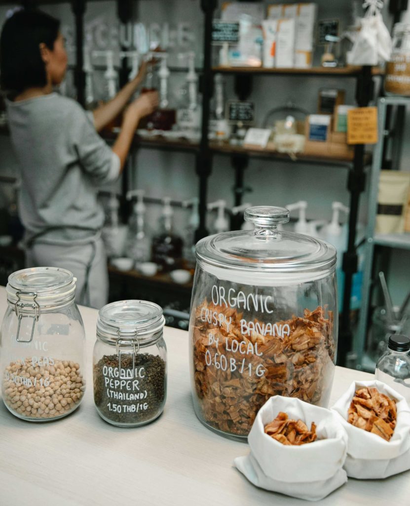
Be it for personal projects or business, self-made stickers are a great way of adding a personal touch. You need the best sticker paper for making the ideal labels. An ideal sticker paper should be printer-friendly and easy to apply.

This article will discuss different types of sticker paper to help you decide which one is the most suitable for you.

Color

Sticker paper can be clear, white, or metallic, depending on the look you want to create. If you are intending to make defined stickers, you should opt for clear paper. For professional labels, white paper is more traditional. 

The opacity of the sticker background will help you determine the color of the paper you should use.

Texture

Sticker paper is usually available in either a matte or glossy finish. If you want your sticker to have a rustic or paperlike finish, go for matte. This sticker paper looks like standard paper but has an adhesive back.

You can write on this material, and the ink will not smudge unless it comes in contact with water.  You need to keep in mind that matte paper will not be as lustrous and vivid as glossy paper.

For the best glossy sticker paper, look for the high-end ones. They might be a bit more expensive, but they will not be flimsy, and the shine will last longer.

Printed stickers made with glossy sticker paper look more professional and resemble the ones manufactured in factories. This material has a glossy and smooth texture. It is difficult to write on this medium as the ink tends to slide off the surface and can smudge easily.

Temporary vs Permanent

There is a wide range of adhesive options. While there are some permanent stickers, there are also some stickers that are re-peelable. Re-attachable stickers can be removed and placed elsewhere without damaging the sticker.

It will also not ruin the surface it was previously attached to. This is very handy when you make an error and need to move a sticker. Many individuals do not prefer stickers that are detachable, but in some cases, they are suitable and necessary.

If you are opting for repositionable stickers, ensure that the material is high quality and will not destroy the surfaces you put it on. You need to keep in mind that re-attachable sticker paper costs more than the permanent kind.

Permanent sticker paper is useful when you have confidence in your ability to place them correctly the first time. They also have long durability.

Vinyl

Vinyl sticker paper has numerous benefits. It is stretchable, which allows easier application on both uniform and curved surfaces. It also has higher longevity and a nice, smooth texture.

Opt for printable vinyl sticker paper to make the process easier. You can find many versions that are compatible with your printer. The most commonly used vinyl materials are listed here.

White Glossy Re-attachable Vinyl

The smooth application of this material is easy as they have strong adhesive properties. It is resistant to water and outdoor conditions. It can also be removed easily and doesn’t leave behind any sticky residue. 

The uses and implementation of this type of sticker paper are incredibly versatile. It can be applied almost everywhere.

White Matte Re-attachable Vinyl

Matte vinyl stickers provide a more subtle and minimal finish. This material is also water-resistant, durable outdoors, and has no bubbles. 

White Glossy Permanent Vinyl

This is the best sticker paper for industrial use such as warning and identification labels. The application is also easy. However, it is not bubble-free. It is ideal for outdoor use as it is very resistant and has high longevity.

Clear Removable Vinyl

This material is perfect for making clear stickers, window adornments, and stickers for business promotions. It is most suitable when you don’t want any visible background.

It has a transparent outlook. You can apply it to glass surfaces and improve the aesthetics. The vinyl makes it resistant to abrasion.

Metallic Vinyl

Metallic vinyl gives a more aesthetically pleasing appearance. It has a reflective surface and can literally make your object look shiny. It is also quite durable. If you want to make holographic stickers that are also durable, you can use this material.

You can also opt for this material if you are planning to make glitter stickers. Metallic vinyl’s quality is high, and the stickers made using it will last a long time.

BOPP

BOPP stands for biaxially oriented polypropylene. It is a plastic-derived material and is suitable for attaching to objects that are subject to constant wear and tear.

White Permanent Glossy BOPP

This material is very resilient. It is resistant to scratches, heat, and oil. Its glossy finish gives it a sophisticated appearance. The details of the writing and the art of the sticker will be very vivid when this material is used. It also generally costs less than the white vinyl versions.
White Permanent Matte BOPP

This is ideal for making labels that can be written on without ink smudging. You can write with pens, pencils, or markers on this sticker. This gives you more freedom to add a handcrafted finish with your own calligraphy and drawing.
As it does not have any protective layer like a laminate, it offers reasonable longevity. This material allows you to give a natural, organic appeal to your products.   

Transparent BOPP

Transparent BOPP has all the qualities and benefits of the regular white BOPP with the addition of having a clear background. If you desire the object to be visible through the sticker, then this will be the most suitable option.

Overview

Stickers have many functions and are very useful in making objects look more appealing. They are incredibly useful and are very handy when you are organizing your things.

Making your own stickers is an exhilarating experience where you can put your creative juices to good use. One of the essentials of DIY stickers is sticker printer paper.

Make sure to opt for one that is compatible with your printer. Hope this article helped you in finding the best sticker paper for you.

How to Make Transparent Stickers

How to Make Transparent Stickers
Photo Credit: Sarah Chai

Have you ever wanted to make DIY gifts but weren’t sure how to make transparent stickers? Many people love the idea of labeling their possessions with DIY clear stickers, saving money in the process, as these clear printed stickers do not come cheap. Read this article for a comprehensive analysis of transparent stickers and the ways they can be made at home.

What Are Transparent Stickers?

Transparent stickers, as the name suggests, are clear labels that contain pressure-sensitive adhesive on one side. This allows the strip of paper or thin plastic to stick to surfaces. There aren’t any particular shapes or sizes of generic clear sticker paper. If you want to label, say, a jar, clear labels can be made quite easily. Attempting to make one for the first time will be an interesting and fun experience.

Why Make Transparent Stickers?

Creative personalities are always on the hunt for innovative DIY ideas. With their usefulness ranging from gifts to personal and professional organization, DIY clear labels can add a personal touch to everything in our daily lives.

  • They can be used to label and design beautiful things and keep the design clean and almost spotless.
  • With careful application, small cracks or breaks in glass containers can be hidden and effectively repaired.
  • Stickers can remain invisible to the eye and maintain the consistency of the item’s design.
  • They are great gifts that you can give your friends and loved ones.
  • Collectors are very passionate about maintaining their personal scrapbooks or wall displays.

How to Make Transparent Stickers at Home

Necessary Materials

The following materials are the minimum requirements. Fancier equipment can certainly accelerate the procedure along with better outcomes, but might not entirely be DIY.

  • Printouts or photocopies of your design. (A laser printer is suggested for printouts.)
  • Transparent tape. (Make sure the adhesive is strong enough to withstand getting wet and will stick well on the surface.)
  • Clean water. (You can use dirty water, but why would you?)
  • Spoon. (Other rigid materials like scissors, cards, or a piece of lego may be used. Avoid using your fingernails.)
  • The object to paste the cute transparent stickers on.

Procedure

Following is a brief, step-by-step tutorial on how to make stickers with tape.

  1. Take your time in choosing the design that you want on your sticker if you are attempting this for the first time. A successful result will go a long way in building your confidence.
  2. Print or make photocopies of your design. Make sure the ink is settled in.
  3. Carve out the design from the paper according to your requirements. We recommend you cut out multiple pieces as options in case the initial attempt is not successful for some reason.
  4. Paste the paper onto the sticky surface of the clear tape. Make sure the design is facing the sticky side.
  5. Cut the tape off at a point slightly away from the paper.
  6. Trim the edges of the tape that are extensions from the perimeter of the paper.
  7. Use the spoon to strongly rub on the label in order to ensure every point on the paper is stuck to the tape. Any trapped air bubbles will also have a chance to escape during this process.

    At this point, you should have a well-shaped label. You can make multiple copies of the same prototype by following the same steps. Only the transition to the sticker’s transparent background is what remains.
  8. Submerge your label in a jar of water. Give it some time, as the water needs to seep into the paper and make it soft and loose. This process usually takes around five minutes. However, depending on the size of the paper used, the time may vary. Check the softness of the paper to determine if it is ready to be taken off.
  9. Take the label out when you feel it is ready. Let the water drain before you touch the paper, as an accidental rough scratch might destroy the consistency of the design, if not the whole project altogether.
  10. Gently use your thumb to rub on the paper. Make sure you do not press overly hard, or the scenario mentioned in step 9 might occur. Rubbing too hard might start removing the design from the tape. Remember, you can always put the label back into the water if you feel any portion of the label is not properly soaked and might require extra force to scrub off.
  11. Once the paper is completely scraped off, the design should remain elegantly displayed on the tape.
  12. Give the newly created stickers time to thoroughly dry. Wet stickers might not be completely adhesive, and prematurely attaching them might lead to a catastrophic failure.
  13. Upon drying, the sticker is now ready to be pasted on the desired container.

FAQs:

Does the sticker lose its adhesive property permanently once it is wet?

Although it does lose its stickiness while being wet, the adhesion will return as the sticker dries.

Once crafted, how durable are the stickers?

The durability of the stickers totally depends on the material used. Stronger adhesives last longer, and vice versa.

What ensures the sticker’s transparent background?

Removal of the paper leads to the transparent background.

Can I choose any design I wish and make clear printed stickers with them?

Yes you certainly can, although a loss of detail can be an issue for complicated graphic designs.

Can I print clear stickers at home?

Of course, you can. After all, this is an indoor DIY project.

Final Words

DIY clear stickers are lovely additions to objects that need labeling at home or work. There is no end to the possible designs that you can print on clear sticker paper. As long as you have the knowledge of how to make transparent stickers, you can be assured to never misplace the sugar and salt jars at home anymore!

How to Make Your Own Stickers for Marketing

How to Make Your Own Stickers
Image credit: shutterstock

If you are considering how to make your own stickers to promote your company (or just for fun), you have probably already realized that there is a lot more to the design process than you might have initially thought.

With the proper use and design, stickers can be an excellent marketing tool for almost any company. The issue is that most individuals have no idea where to begin when it comes to creating stickers. And even graphic designers with little or no expertise in sticker design can make a complete mess of the process.

If you want to use the stickers for marketing or promotional purposes, it is not enough to just design a visually appealing sticker; you must also consider several additional factors. For example, you must consider the message you want to convey, the physical copy of the sticker, the size, the shape of the sticker, the font, and, of course, the printing process itself. If you have not done any print designing before, this can be the most challenging part of the process for new designers. Designing labels or stickers can be a wholesome process if you know what needs to be done.

To take you through the process of making and printing a perfect sticker, we have put up the following tutorial.

Select the Appropriate Size and Shape

How to make stickers that look amazing? Choosing the appropriate size and shape for your sticker should be the first step in creating your design before moving on to other considerations. In the vast majority of instances, the intended purpose of the sticker will be the determining factor.

The standard rectangular and square pattern is maybe the most popular form for a sticker because it does not need any extra die-cutting or special shaping. It is by far the most cost-effective sticker to manufacture.

If you want to know how to make stickers with a much more custom-shaped design, printing your sticker on clear vinyl is the most cost-effective choice. By doing so, you will be able to make a unique design for your custom vinyl stickers. However, the sticker will still be a standard square or rectangle in form.

Further, if you are planning to put them on window panes or another clear surface, you might need to have them printed in reverse.

It is also important to remember that you are not restricted to sticker designs with a diameter of just a few centimeters. Modern printing businesses will allow you to produce stickers up to a few feet in length and a few inches wide. If you are trying to make a wall sticker, this can be highly beneficial.

Make It Vibrant and Eye-Catching

It does not matter where you intend on putting your sticker; the goal is typically to draw the interest of others.

The problem is stickers are typically seen from a considerable distance, making them difficult to read. The intended audience for the sticker can be anywhere from just a few feet to a couple of hundred yards away, depending on whether it is attached to a laptop cover, a vehicle bumper, a lamppost, or any of the countless other possible places.

For this reason, you should ensure that your sticker is as bright and colorful as possible in the majority of instances. Making your sticker bright and eye-catching will guarantee that it captures the attention of its audience and gets the recognition it deserves.

Keep in mind that making your sticker vivid and colorful does not always mean that you must include every color of the rainbow into your design. Usually, one or two colors will be enough.

Using too many colors may result in an unorganized and downright unattractive design. So stick to only two or three primary colors in your design instead of using more than that. You can also make custom stickers or make your own sticker book if you want to (for reference purposes). 

Now that you know how to make your own stickers, let us give you some more information.

Image credit: shutterstock

Use Bold Font

When designing your sticker, one of the most important aspects to consider is the kind of font you want to include. Your sticker will almost certainly convey a message, and if this is the case, you must make sure that the message is readable by the audience. 

If you were designing a leaflet or a flyer, it would be entirely acceptable to have paragraphs of text printed in a tiny font. However, it would be a significant mistake if you were designing stickers. The purpose of stickers is not to tell the audience about your life; instead, they are intended to increase brand exposure and draw attention.

Pick a font that is both strong and clear and that it will be readable from a distance. Due to the usage of just capital letters and big font size, the readability and impact of the text will be enhanced significantly.

Using contrasting colors can also help enhance the boldness and readability of the sticker text. Keep in mind that when written in tiny font sizes, sans serif font can sometimes look bolder and more readable than serif type.

Don’t Overuse Text

As we briefly stated in the previous point, the purpose of a sticker is not to tell the audience about your life story or to teach them about any product you provide but to draw attention to your brand and build brand awareness. If your company has already established its identity, using just a logo and no text may be a fantastic approach to promote it.

On the other hand, text might well be required in certain instances. It can even be beneficial in drawing attention. 

Incorporate Your Brand

Color schemes, font, and other design elements are essential considerations. However, your brand logo or name must remain at the center of your design.

However, the uppercase characters and specific contrasting colors can have the most considerable effect on being noticed. Therefore, you should never include colors or fonts that do not represent your brand or your already-existing brand image in your sticker design.

When it comes to promotional stickers, one of the primary goals is to enhance brand awareness. If your sticker does not accurately reflect your company, it will not have the intended effect or provide a return on your investment. 

The selection of a color scheme representing your brand throughout all other visual media is essential (leaflets, banners, website, etc.). In addition, the presence of your logo on the sticker is also usually seen as a good idea since it should be the most instantly recognizable element of your brand image.

Keep Things Simple and to the Point

You may have noticed that almost every suggestion we gave in this article is straightforward and to the point. It is something that you should bear in mind while designing nearly any sticker.

Although leaflets, pamphlets, and flyers may include a lot of information, stickers should be as basic and minimalistic as possible. When it comes to communicating the desired information and increasing brand recognition, your company’s logo may be all that is required in most cases.

Aim for simplicity and effectiveness when designing stickers to convey your idea as clearly and briefly as possible. 

Printing Your Stickers
Image credit: shutterstock

Printing Your Stickers

After the designing phase is done, now the question arises: How to print stickers? The material on which your stickers are printed is a factor when it comes to the actual printing of your stickers, and you have a few different choices. Although almost all stickers are printed on PVC/vinyl, the specific characteristics of that vinyl may significantly differ in the final product. 

One option is to print your stickers on matte or glossy material. Almost all printing companies nowadays will provide you with a selection, and ultimately, the option is yours. Glossy papers will have a high shine, while matte stickers will have a lower shine. 

Matte or glossy is almost entirely a matter of personal taste. However, a matte finish may give your stickers a more quality appearance and feel in certain instances. You can use Cricuts to print as well. So, you might have a question on how to make stickers with Cricut? Cricut is a machine that cuts paper according to a given design. They are a great resource if you want to make homemade stickers. Also, you can use laser inkjet printers to print any type of sticker perfectly. 

So, now you have an overall idea about how to make your own stickers.

Conclusion

If you follow the above advice correctly, you are almost likely to develop an excellent sticker design and achieve the desired effect. To get the desired result when printing your stickers, choose a reliable printing company with expertise in sticker printing.

Although these instructions should serve as a starting point for your design, the success of your sticker will ultimately depend on your own creativity. Follow this advice, and make your own stickers.

How to Choose the Best Font for Labels: 7 Things to Consider

Image credit: Shutterstock

The typography on the label of your product is more than just mere words; it is style and personality too. It is a way to communicate with your customers and represent your brand.

Therefore the font design, style, size, color are all important things to consider. You can also have a combination of fonts. But choosing the Best font for labels is tricky. You want something that is functional but also has a hint of uniqueness to make your label stand out.

Difference Between Typeface and Font

You will hear both terms ‘typeface’ and ‘font’ when choosing a font for the label. A typeface is a font family. For instance, Helvetica is a typeface whereas Helvetica italic, narrow, and light are fonts of that particular typeface. 

Put simply, the typeface is the overall design of the characters, and fonts are variations of the typeface. However, for this article, the term font will be used instead of typeface, and the accessories instead of the font.

7 Things to Consider When Choosing the Best Font for Labels

Fonts are expressive. They can be fun, bold, tacky, elegant, and even loud. 

Just think about the TIME magazine logo. The classic, thin-lined font represents authority. Now, think about the typography of Coca-Cola. Those swirly letters indicate a more fun persona. Almost every popular brand tries to use a unique font that people can remember.

To choose the Best font for labels, consider the following factors.

1. Your Brand Persona

After coming up with your product, you must think about your brand’s persona and identity. You have to clearly identify what your brand stands for. 

Is it something fun, sporty, eco-friendly, or sophisticated? You have to be the judge of that. For instance, if you are selling high-end cosmetic products, then your brand persona should reflect luxury and beauty. In that case, use an elegant font.

If your brand is all about weddings, then consider a calligraphic font that is perfect for formal events and looks amazing on monogram envelope seals and invitations. 

For organic food and beverage labels, use clean fonts as they represent simplicity. But for indulgent food, use something more visual and loud.

If you are already using a font on your brand logo, try to use the same or similar font for your label. This makes the brand more recognizable and consistent.

2. Your Audience

Researching your target audience will give you a better idea of what font you should choose. If your label caters to children, you can use bubbly, swirly, or fun fonts. If you have a sophisticated audience, use simple and elegant fonts to grab their attention.

Once you have narrowed down your demographic, it will be much easier for you to choose. However, you still need to do research on font personalities.

3. Understand the Font’s Personality

It may sound surprising but fonts really do have personalities and their font trait has to match with your brand. For instance, a bubbly font on the label of a fancy champagne bottle will never look good.

If you want to portray something elegant, use classic fonts with narrow lines such as Garamond, Lola, BodoniAnt, Script, or Verdana.

Choose fonts that are quirky and fun for personable or playful products. Fonts such as Pacifico, Lobster Two, Gasoline Alley, and Princess Sofia are perfect for this. They have plenty of curves with oscillated highs and lows.

For a bold and modern vibe, choose anything between Gills San, Julius Sans One, Bernhard Fashion, Raleway, or Scada. These forms have a more uniform structure and angular look.

Handwritten fonts may not seem conventional but are very attractive and warm. Fonts such as Loved by the King, Waiting for the Sunrise, Bella Donna, and Homemade Apple look friendly and offer a rustic vibe.

These are only a few personality types. You might have to do a lot more research to find the perfect one for your label but your effort will pay off.

4. The Font Size

Font Size
Image credit: Shutterstock

If the text is too small, your audience will have a hard time reading it but if it’s too big, it might crowd your label design. Asa rule of thumb you should never use a font smaller than size 5. And remember, the text on a computer screen is more readable than on the label so consider going a size larger.

It can be very hard to choose the right size. To find the right balance, you have to go through trial and error. Print out a draft with different sizes of the same font and compare. This way you can also check the spacing.

Sometimes font sizes will be dictated for you. Government warnings, ingredient lists for beer, and other alcohol labels have a minimum size requirement that you must follow. For these, always use simple fonts and avoid using fancy fonts because they are less readable in smaller sizes.  The easiest font to read is Helvetica and Georgia. Other easy to read fonts are-

  • Arial 
  • Verdana
  • Calibri
  • Rooney
  • Open Sans
  • Lato

These fonts are clean, take less space, and remain readable even in smaller sizes.

5. Combination of Fonts

Using only one font for everything on your label might seem boring. A combination of fonts can do wonders for your product. But never use more than three types of fonts.

All your favorite fonts can be categorized into Serif and San Serif. 

Serif

Serif fonts have a formal design and most of them have a finishing stroke on the letter. Times New Roman is a classic example. Serifs are eye-catching and perfect for the title section of your label as they are the most readable font for print.

San Serif

San Serif fonts are cleaner and do not have any finishing stroke such as Verdana and Helvetica. Serif fonts are easily recognizable and are great choices if your audience is visually impaired or small children. 

San Serif fonts are great for the ingredient or important information section of your label because of the readability.

If you are using two fonts, your best choice would be to choose one from each category and see if they complement each other. If you want to choose three types of fonts, then choose one Serif and two San Serif fonts for a good combination.

Your primary font can be whatever you want, but your secondary font should be basic. 

The main purpose of the label maker fonts is to be legible to the audience. This is also the reason you should not use over three fonts. The more fonts you combine, the more difficult it becomes for the reader.

No matter how cool the font looks, readability is the key for label fonts. So make sure your combination of fonts looks good and doesn’t overwhelm the reader.

6. Font Accessories  

We have quite a few options to accessorize our fonts. We can make them bold, italic, or even underlined. But these embellishments might make your font less readable so be careful. 

Using too much bold or italic can create extra noise and take unnecessary space. Underlining can make it difficult for readers to differentiate the letters. A rule of thumb is that if your primary font is fancy, do not use these embellishments; it will only be distracting.

7. The Visual Hierarchy 

No one reads everything on a label – at least not all at once. So, your product label should have a visual hierarchy to help people skim through all the information. If your label has a story to tell, then an effective visual hierarchy is even more important to communicate with the customer.

Your label will have a beginning, middle, and end part and in those three sections, there will be some information more important than others. If you use the same font, it will be harder for the customer to distinguish which is more important to read.

You will have to carefully decide which information deserves a heading and which is just going to be printed on the body copy with the secondary font. Big, bold, unique fonts are great openers for your visual hierarchy and introduce your product to the customer. Make sure it is readable, do not over accessorize, and highlight key information in order to help your readers skim through in an orderly manner.

Also, you need to know which kind of label really fits your items. There are uncoated labels, semi-gloss labels, high-gloss labels, inkjet only labels, laser labels, colorful labels, and many more to select from.

Final Thoughts

Inappropriate fonts make your label bland and won’t portray your brand’s message effectively. On the other hand, the right font can enhance your label design and speak to your viewers in more ways than you can imagine. Researching fonts can take time so be patient, create a list of your favorite fonts, and find the one that matches all the criteria listed in this article.